Go City
Making city exploration effortless for millions of travellers
Industry
Travel & Tourism
Services
Customer Experience Transformation, Interface Design, Design DNA
Year
2021
The crew & the stage
Note
As of June 2022, some of this work is live, some has changed with Go City’s rebrand, and some remains under NDA until launch.
When the world's largest sightseeing pass business needed to match its digital experience to its ambition
Go City connects millions of travellers with over 1,300 attractions across 30 countries. One pass, endless possibilities: skip queues, save money, explore cities freely.
But when they approached us, there was a gap between that promise and what users were experiencing. Whilst Go City was scaling globally, their digital experience was holding them back. Users were questioning legitimacy. Pass types weren't clear. Trust wasn't there. Every city site looked different. The experience wasn't matching the excitement of discovering a new city.
That's where it got interesting. This was a chance to build something that could grow with them — a system that worked across dozens of cities, a journey that turned sceptical browsers into confident bookers, and an experience worthy of the adventures people were about to have.
Before the redesign: inconsistent city sites and unclear product messaging.
What I work on
Leading the design direction
Co-led the project, driving the visual and interaction direction across web and app, and guiding another Product Designer to ensure consistency, accessibility, and a cohesive system across platforms.
Designing the journey
Defined the end-to-end experience from discovery to purchase, shaping flows, hierarchy, and content behaviour across all customer touchpoints.
Defining the look & feel
Owned the digital evolution of Go City’s brand, translating marketing assets into an accessible, scalable, product-ready design language.
Building for scale
Created a multi-platform design system powering web, app, and B2B, enabling consistency across 30+ cities and dramatically speeding up development.
Designing for everyone
Embedded accessibility and inclusive patterns into every decision and coached the team on applying AA standards across interfaces.
Cross-functional alignment
Partnered with Brand, Marketing, Product, SEO, and Engineering to align competing priorities, drive decision-making, and ensure a unified experience across all customer-facing surfaces.
What was broken and how we fixed it
Through customer interviews, analytics, and usability testing, we uncovered six critical problems. Here's what was broken and how we fixed it:
When two options felt like a guessing game
Users couldn't differentiate between Explorer and All-Inclusive passes or understand what they were buying.
“I don't understand the difference between these passes. What if I buy the wrong one?”
Customer, usability testing
I aligned the UX Lead, PM, and Go City stakeholders around a new direction after reviewing conflicting proposals and mapping the implications for all cities.
How we clarified it:
- Introduced a new pass selector making comparisons intuitive
- Side-by-side layouts showed price, features, and included attractions
- Made the core difference obvious: Explorer (choose X attractions) vs All-Inclusive (visit for X days).
Testing showed users could now confidently choose in
30 seconds
The redesigned pass exploration flow helping users compare options and understand exactly what they're buying.
Giving people what they actually came for
SEO and research showed people searched for specific attractions, not passes, but the site led with passes anyway, forcing users to work backwards.
"I want to know what attractions I can visit, then decide if a pass is worth it.”
Customer, usability testing
I facilitated alignment between Brand, SEO, and Product teams to prioritise clarity over marketing density and reshape the IA around real user intent.
How we redesigned it:
- Rebuilt the IA to put attractions at the centre
- Immediate access to all attractions with filtering by category and location
- Introduced curated itineraries for inspiration
- Added clear pass indicators to each attraction to clarify pass eligibility
It aligned with how people actually think: “I want to visit attractions. A pass is just the best way to do it.”
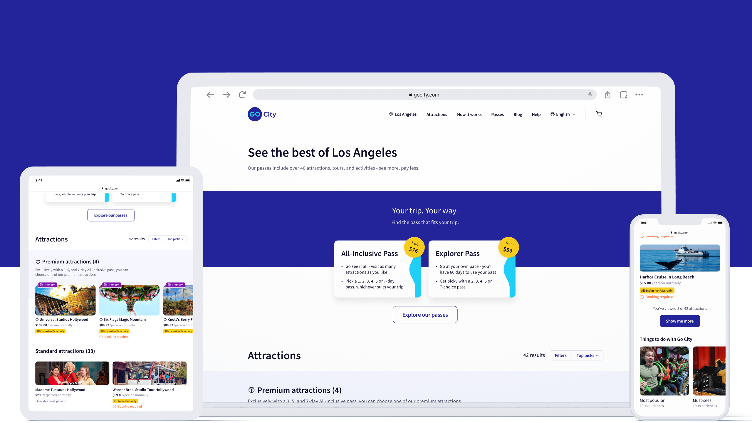
The redesigned city homepage: brief pass overview at the top, then attractions front and centre with clear pass indicators, curated itineraries for inspiration, and filtering by category and location.
When buried reviews were killing confidence
Hidden reviews, unclear terms, and no transparency around booking requirements made the experience feel untrustworthy.
"How do I know this isn't a scam? The reviews feel hidden and the terms are confusing.”
Customer, usability testing
I worked with Brand, Legal, and Marketing stakeholders to prioritise transparency over promotional copy and redesign trust moments across the funnel.
How we rebuilt trust:
- Redesigned Trustpilot integration with proper hierarchy
- Introduced “Buy with Confidence” modules (90-day cancellation, customer service)
- Added detailed “What’s Included / Not Included” sections
- Made terms and requirements clear with proper hierarchy
- Strengthened security signals throughout checkout.
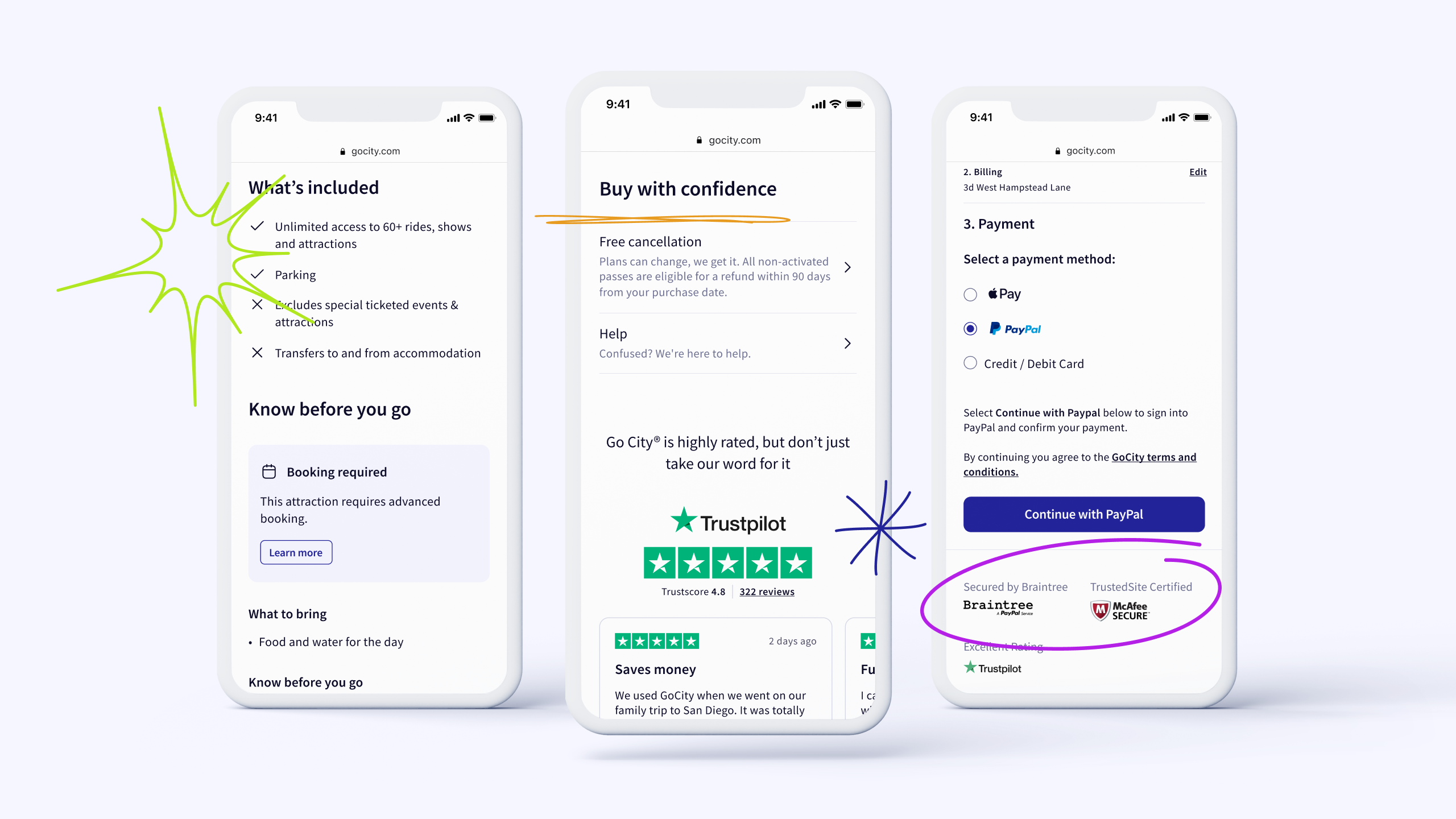
Three moments of reassurance: (1) What's included and what to know in advance, (2) "Buy with Confidence" with 90-day guarantee and prominent Trustpilot reviews, (3) clear terms and security signals at checkout.
When every city felt like a different company
Inconsistent layouts across cities, poor hierarchy, and buried details made basic information hard to find.
I guided our second designer through component explorations and ensured each proposal aligned with the emerging design system and accessibility principles.
Our approach to unifying the experience:
- Built a modular component library working across 30+ cities
- Unified navigation, harmonised layouts, colour, and typography.
New cities could be launched in weeks, not months, whilst maintaining consistency.
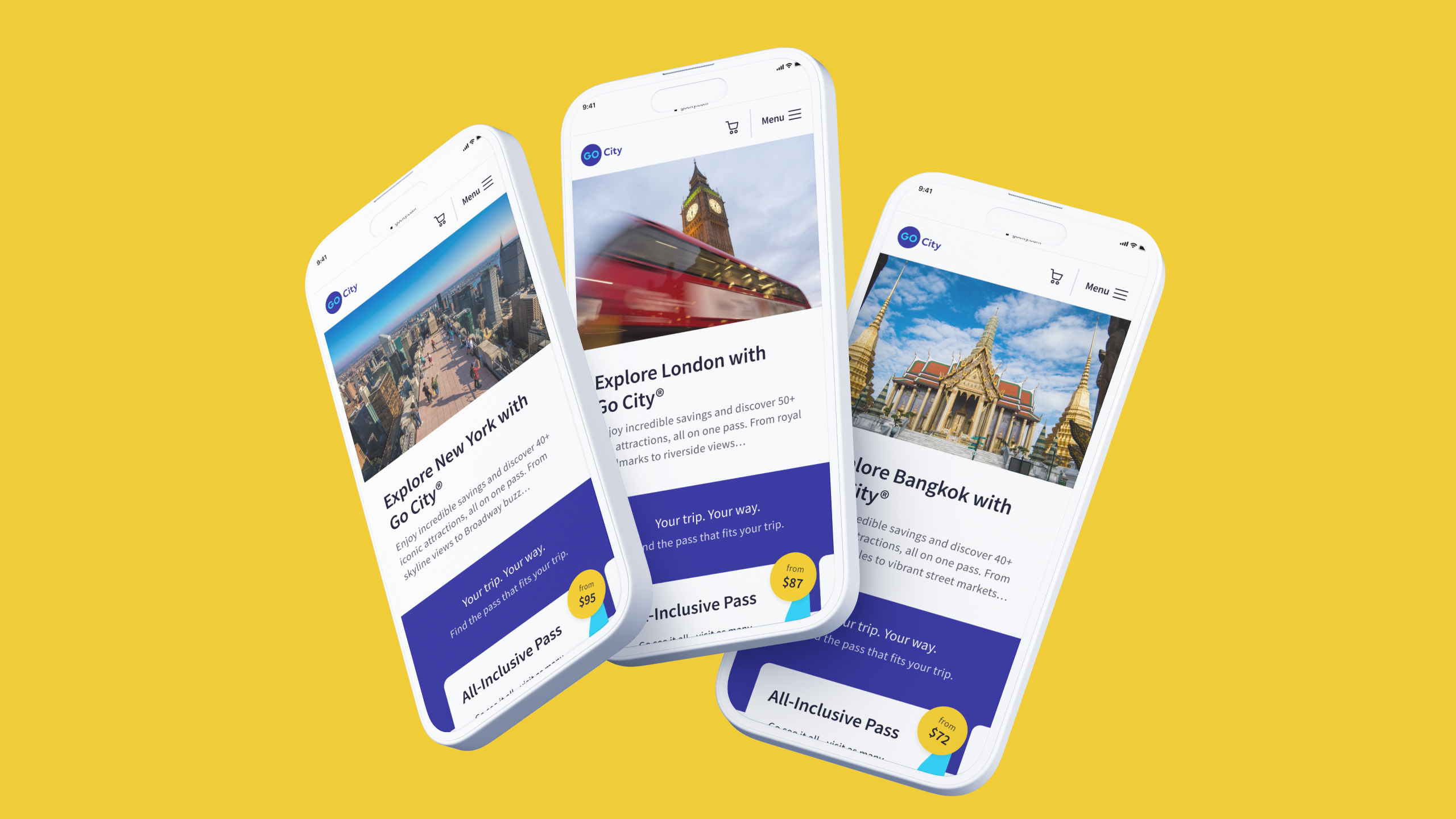
Scalable consistency across 30+ cities with unified navigation and layout, flexible for each destination's unique content.
Making the app feel like a travel companion, not a question mark
Users didn't know if their pass was active, when it would activate, or how to use it at attractions.
I coordinated with Product and Engineering to define information timing and ensure critical details surfaced at the right moment in the app journey.
How we improved the app experience:
- Clear onboarding explaining pass activation
- Easy attraction discovery (filtering, maps, favourites)
- Booking requirements and hours shown upfront
- Personality through warm empty states and encouraging tone.
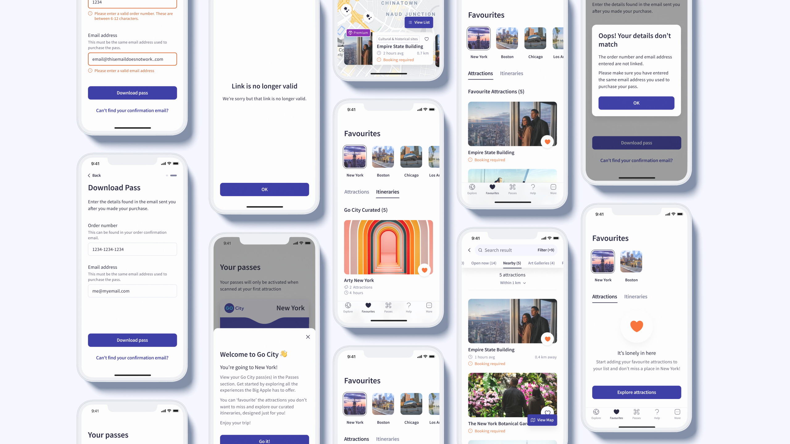
App redesign across key journeys: pass download with clear error handling and confirmation, favourites for saving attractions and itineraries (with warm empty states inviting users to start exploring), map view for location-based discovery, filtered attraction lists (nearby, open now, categories), and favourites organised by city for easy trip planning.
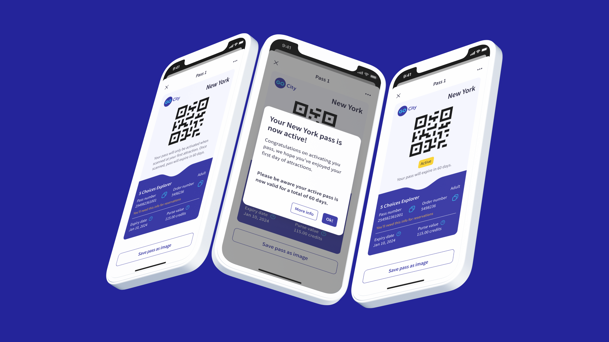
(1) Pass activation clarity: passes remain inactive after download until scanned at the first attraction. Clear messaging confirms activation and shows validity period based on pass type.
(2) Adding personality: favourite button animation concept bringing character to user interactions.
Beautiful and functional, not one or the other
Brand colours and fonts looked great in marketing but created contrast failures, readability issues, and no guidance for interactive states in digital products.
This wasn’t just an IA problem. The visual design was undermining user confidence at every turn, and it required leading with strong design direction and aligning Brand & Marketing on necessary adjustments for usability.
How I evolved the look & feel and led the visual system transformation:
- Adjusted brand colours for WCAG AA compliance whilst maintaining recognition
- Optimised typography for screen readability
- Created photography and illustration guidelines for digital
- Systematised every component with brand purpose and accessibility.
Users described the redesign as "more premium" and "more trustworthy”
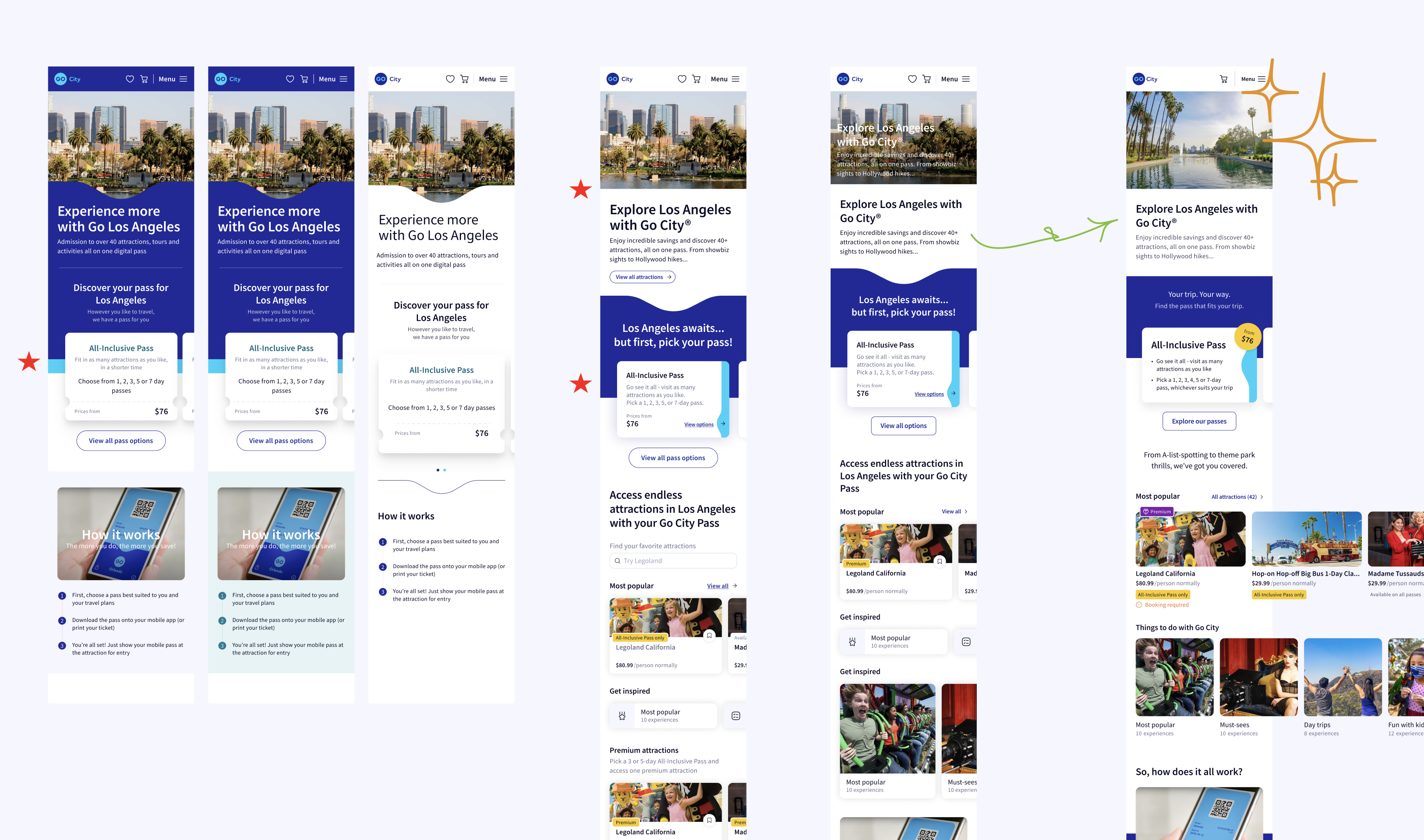
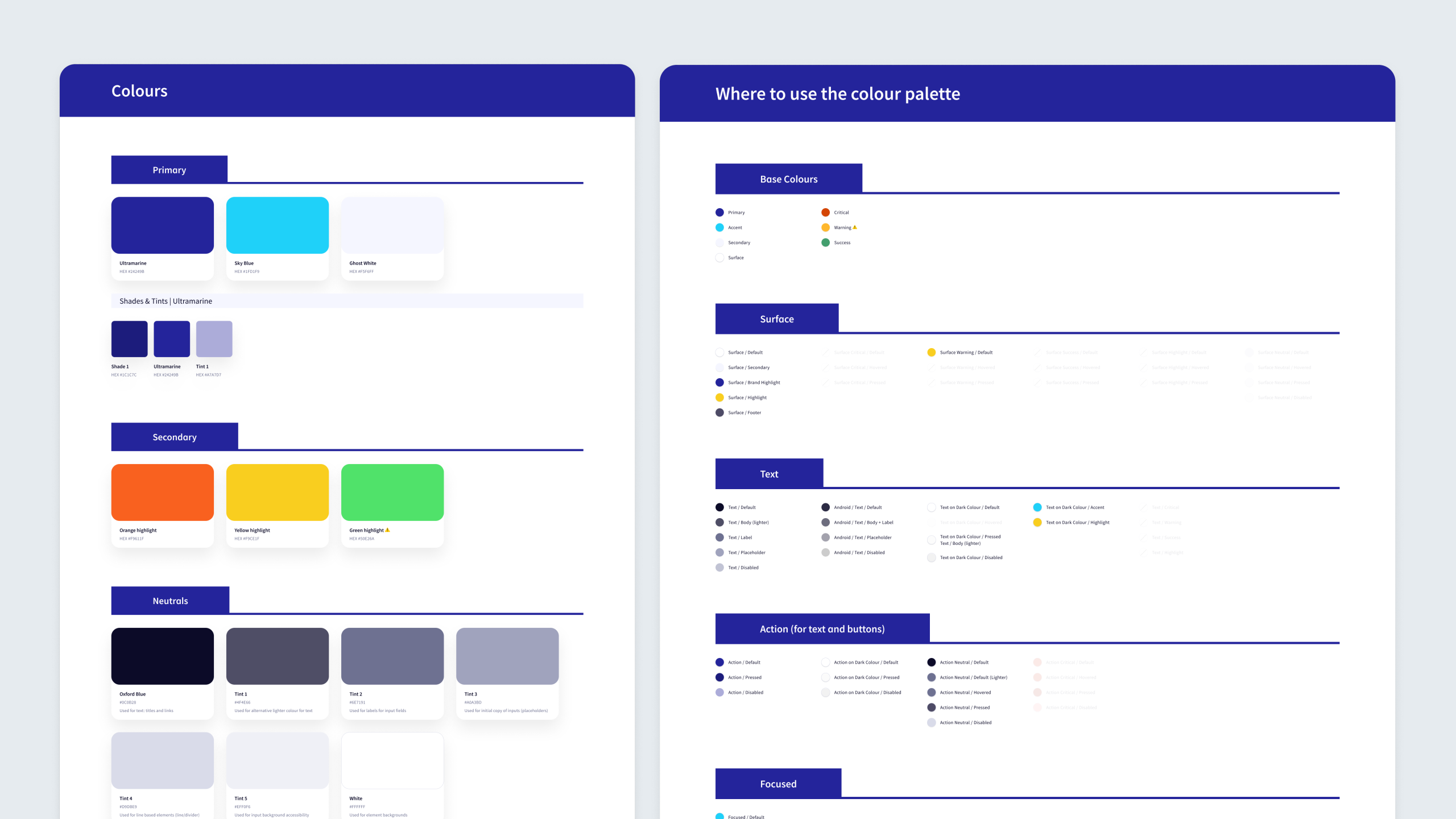
(1) Exploring layouts and hierarchy: testing different approaches for city homepage and attraction page to find the right balance of brand elements, content clarity, visual rhythm, and progressive information disclosure.
(2) Design system and foundation built from scratch: the design DNA that enabled faster design iteration and scalable development as new cities and features launched in subsequent phases.
What users told us when we tested
Created interactive prototypes and tested at multiple stages with 10 participants.
Key validation moments:
- Attraction-first approach: "This makes so much more sense!"
- Pass comparison: Significantly reduced confusion
- Trust signals: Noticeable increase in confidence
- Visual design: "More premium" and "easier to scan"
Critical iteration
After impression testing, we redesigned the attraction listing page, the only one still causing confusion. It tried to do too much at once, so we refocused it on attractions, added clearer filters, and made “Get Inspired” content easier to find.
The trade-off we made
Moved "Recommend a Pass" feature to backlog after testing revealed users thought shortlisted attractions were final selections, which fundamentally broke the pass model. Shipping something confusing would have been worse than not shipping it at all.
What changed
For users
- Pass options finally made sense, with confident decisions in under 30 seconds
- Attraction discovery aligned with how people actually search and plan
- Trust signals made the experience feel legitimate and premium
- App transformed from confusing to confident
For Go City
- City launch time reduced from months to weeks
- Scalable design system now powering web, mobile, and B2B platforms
- Faster, more cost-effective design and development processes
- Foundation for continuous iteration and growth
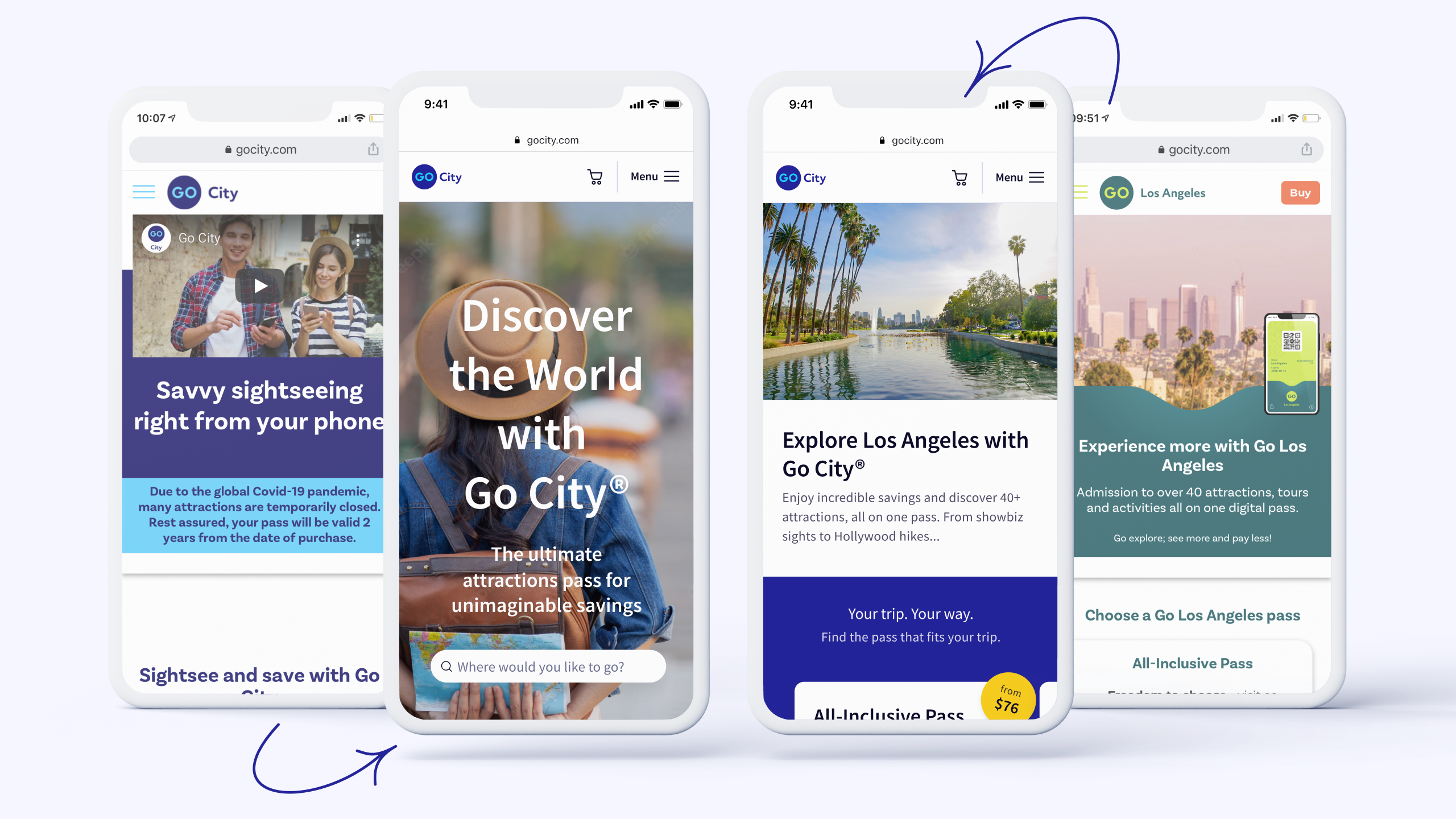
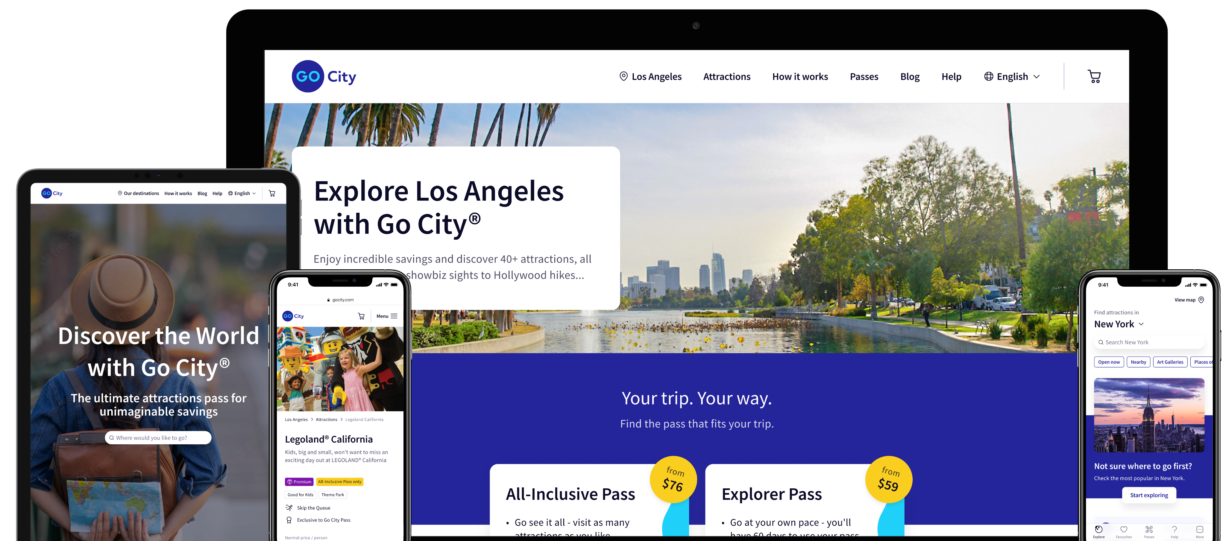
Transformation of global and city homepages: original designs with brand misalignment and accessibility issues (outer screens) versus redesigned solution with cohesive branding, accessible design, and clear content hierarchy (centre screens).
What came after launch
V2 work began immediately with "Recommended Pass," dark mode, homepage improvements, and marketing assets. The design system expanded to the newsletter (aligned with the new user journey) and blog (refreshed to inspire travel and strengthen brand connection).
If I could revisit this project
- I'd have involved content strategists earlier in the IA restructure
- I'd have documented design decisions more thoroughly for inheriting teams
- I'd have advocated for post-launch A/B testing to validate impact
What I learned
Research as the foundation
Moving from assumptions to evidence gave us confidence to make bold decisions and push back on solutions that wouldn't serve users.
Saying no is a design skill
The hardest decisions weren't about what to build, but what to build first. By mapping features against customer goals and business dependencies, we could say "not now" to good ideas to fully deliver essential ones.
Designing is orchestrating many voices
This was not only a redesign. It was a cross-team alignment effort that required guiding designers, marketing, brand, product, tech, and SEO toward a single experience vision. Co-leading the design direction taught me how critical early alignment is when many teams influence the outcome.
Principles create autonomy, not restriction
Guiding another designer through a system redesign reinforced my belief that clear principles (not rigid rules) give teams room to create confidently and consistently.
Clarity builds trust
When users understood what they were buying, they felt confident. When they didn't, they left. Trust isn't built through reassuring copy alone. It's built through clarity, consistency, and honouring what users need at each moment.
Designing for scale
Creating a flexible system with clear principles became a shared language teams across the company could speak. That shared language made everything faster.
From confusion to confidence
one city at a time.

Other work
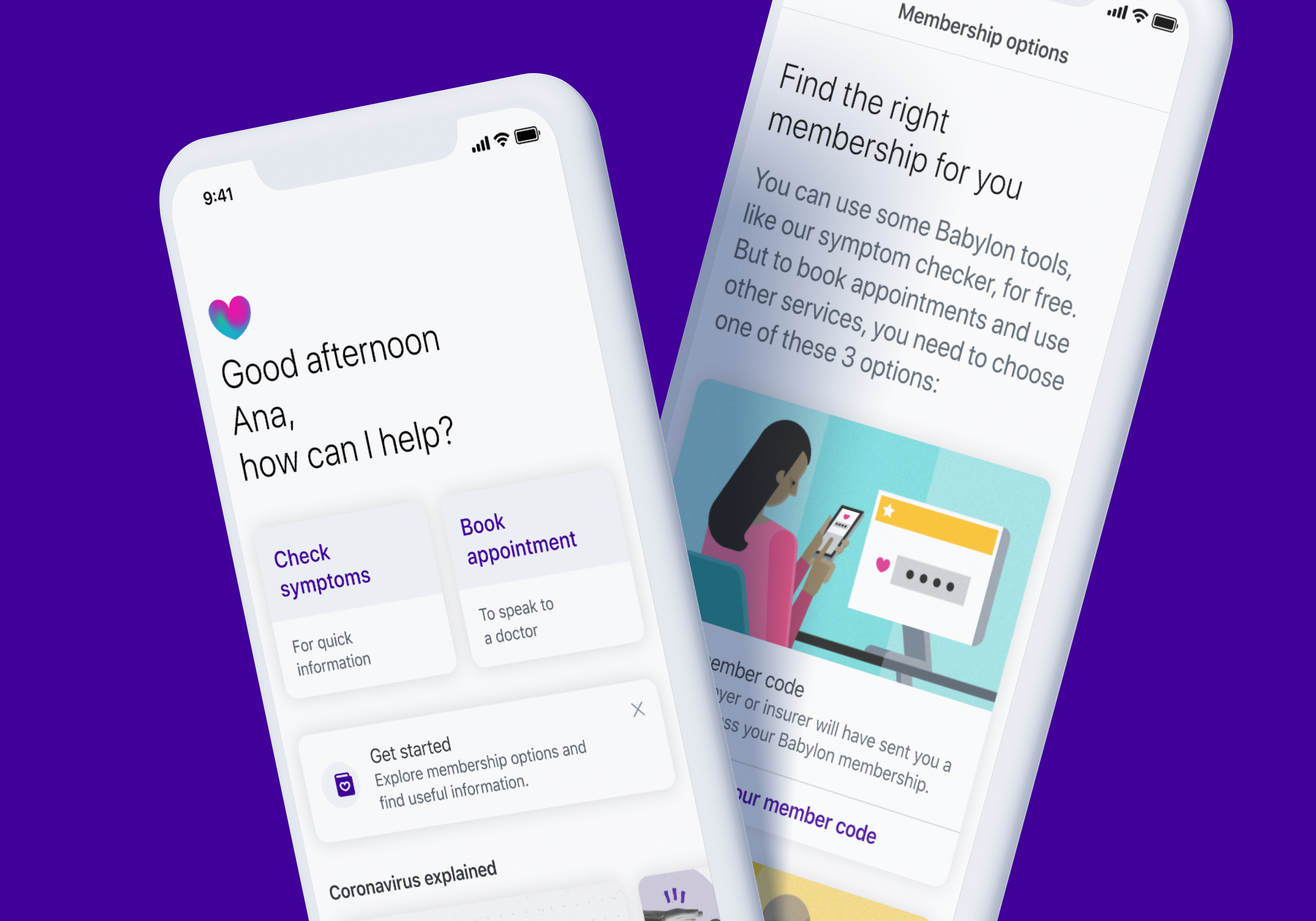
Babylon Health
Helping new Babylon users learn, compare, and activate the right plan for their needs.
Go City
Making city exploration effortless for millions of travellers

Industry
Travel & Tourism
Services
Customer Experience Transformation, Interface Design, Design DNA
Year
2021
Platform
Website & iOS/Android App
Role
Lead Product Designer(co-leading with the UX Lead)
Created at
Reason
Team
[Reason] 3 Experience Designers/Researchers, 2 Product Designers, Product Manager[Go City] Product Owner, Brand & Marketing leads, Tech & SEO teams
Note
As of June 2022, some of this work is live, some has changed with Go City’s rebrand, and some remains under NDA until launch.
When the world's largest sightseeing pass business needed to match its digital experience to its ambition
Go City connects millions of travellers with over 1,300 attractions across 30 countries. One pass, endless possibilities: skip queues, save money, explore cities freely.
But when they approached us, there was a gap between that promise and what users were experiencing. Whilst Go City was scaling globally, their digital experience was holding them back. Users were questioning legitimacy. Pass types weren't clear. Trust wasn't there. Every city site looked different. The experience wasn't matching the excitement of discovering a new city.
That's where it got interesting. This was a chance to build something that could grow with them — a system that worked across dozens of cities, a journey that turned sceptical browsers into confident bookers, and an experience worthy of the adventures people were about to have.
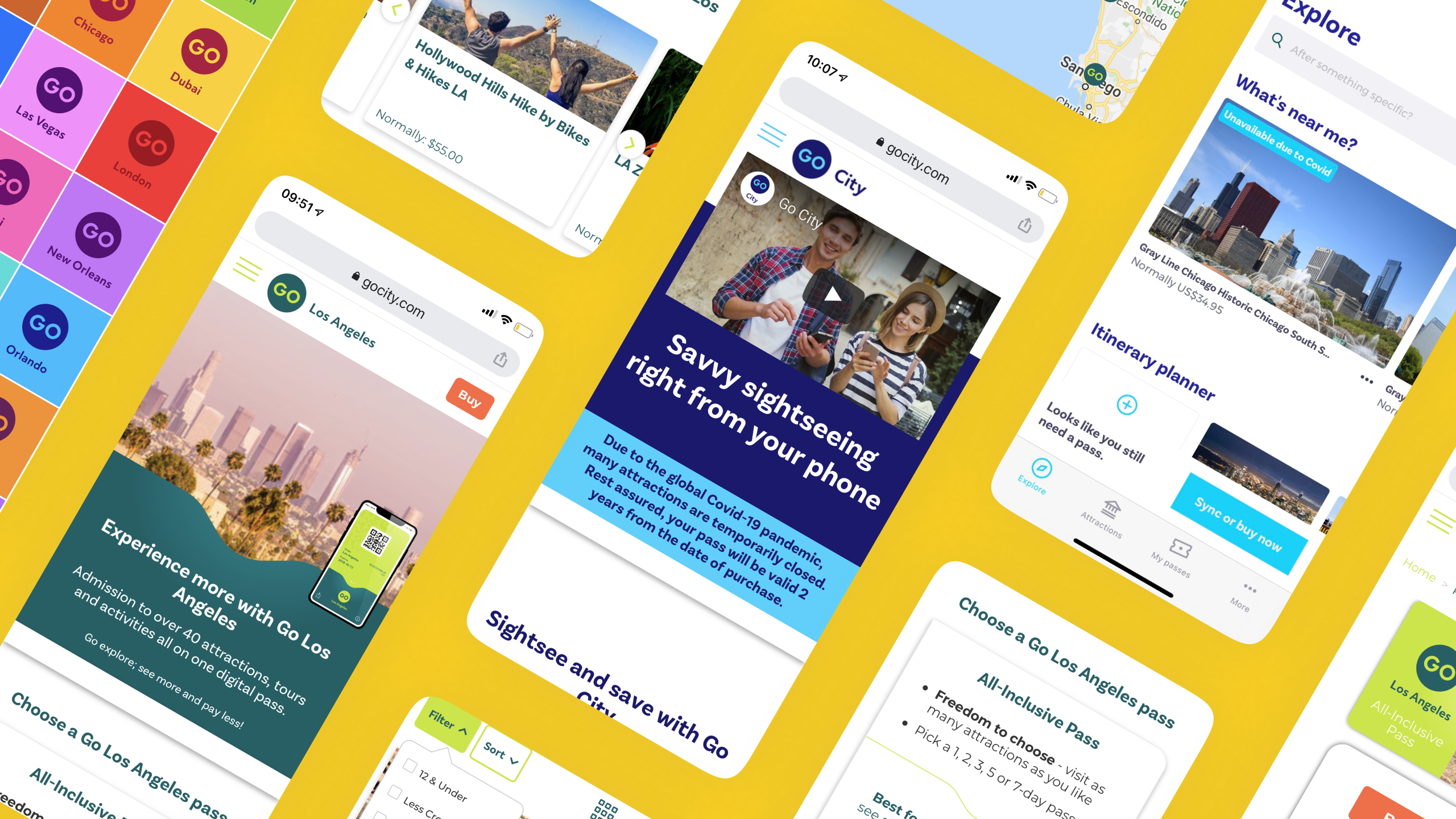
Before the redesign: inconsistent city sites and unclear product messaging.
What I work on
Leading the design direction
Co-led the project, driving the visual and interaction direction across web and app, and guiding another Product Designer to ensure consistency, accessibility, and a cohesive system across platforms.
Designing the journey
Defined the end-to-end experience from discovery to purchase, shaping flows, hierarchy, and content behaviour across all customer touchpoints.
Defining the look & feel
Owned the digital evolution of Go City’s brand, translating marketing assets into an accessible, scalable, product-ready design language.
Building for scale
Created a multi-platform design system powering web, app, and B2B, enabling consistency across 30+ cities and dramatically speeding up development.
Designing for everyone
Embedded accessibility and inclusive patterns into every decision and coached the team on applying AA standards across interfaces.
Cross-functional alignment
Partnered with Brand, Marketing, Product, SEO, and Engineering to align competing priorities, drive decision-making, and ensure a unified experience across all customer-facing surfaces.
What was broken and how we fixed it
Through customer interviews, analytics, and usability testing, we uncovered six critical problems. Here's what was broken and how we fixed it:
When two options felt like a guessing game
Users couldn't differentiate between Explorer and All-Inclusive passes or understand what they were buying.
“I don't understand the difference between these passes. What if I buy the wrong one?”
Customer, usability testing
I aligned the UX Lead, PM, and Go City stakeholders around a new direction after reviewing conflicting proposals and mapping the implications for all cities.
How we clarified it:
- Introduced a new pass selector making comparisons intuitive
- Side-by-side layouts showed price, features, and included attractions
- Made the core difference obvious: Explorer (choose X attractions) vs All-Inclusive (visit for X days).
Testing showed users could now confidently choose in
30 seconds
The redesigned pass exploration flow helping users compare options and understand exactly what they're buying.
Giving people what they actually came for
SEO and research showed people searched for specific attractions, not passes, but the site led with passes anyway, forcing users to work backwards.
"I want to know what attractions I can visit, then decide if a pass is worth it.”
Customer, usability testing
I facilitated alignment between Brand, SEO, and Product teams to prioritise clarity over marketing density and reshape the IA around real user intent.
How we redesigned it:
- Rebuilt the IA to put attractions at the centre
- Immediate access to all attractions with filtering by category and location
- Introduced curated itineraries for inspiration
- Added clear pass indicators to each attraction to clarify pass eligibility
It aligned with how people actually think: “I want to visit attractions. A pass is just the best way to do it.”

The redesigned city homepage: brief pass overview at the top, then attractions front and centre with clear pass indicators, curated itineraries for inspiration, and filtering by category and location.
When buried reviews were killing confidence
Hidden reviews, unclear terms, and no transparency around booking requirements made the experience feel untrustworthy.
"How do I know this isn't a scam? The reviews feel hidden and the terms are confusing.”
Customer, usability testing
I worked with Brand, Legal, and Marketing stakeholders to prioritise transparency over promotional copy and redesign trust moments across the funnel.
How we rebuilt trust:
- Redesigned Trustpilot integration with proper hierarchy
- Introduced “Buy with Confidence” modules (90-day cancellation, customer service)
- Added detailed “What’s Included / Not Included” sections
- Made terms and requirements clear with proper hierarchy
- Strengthened security signals throughout checkout.

Three moments of reassurance: (1) What's included and what to know in advance, (2) "Buy with Confidence" with 90-day guarantee and prominent Trustpilot reviews, (3) clear terms and security signals at checkout.
When every city felt like a different company
Inconsistent layouts across cities, poor hierarchy, and buried details made basic information hard to find.
I guided our second designer through component explorations and ensured each proposal aligned with the emerging design system and accessibility principles.
Our approach to unifying the experience:
- Built a modular component library working across 30+ cities
- Unified navigation, harmonised layouts, colour, and typography.
New cities could be launched in weeks, not months, whilst maintaining consistency.

Scalable consistency across 30+ cities with unified navigation and layout, flexible for each destination's unique content.
Making the app feel like a travel companion, not a question mark
Users didn't know if their pass was active, when it would activate, or how to use it at attractions.
I coordinated with Product and Engineering to define information timing and ensure critical details surfaced at the right moment in the app journey.
How we improved the app experience:
- Clear onboarding explaining pass activation
- Easy attraction discovery (filtering, maps, favourites)
- Booking requirements and hours shown upfront
- Personality through warm empty states and encouraging tone.


(1) App redesign across key journeys: pass download with clear error handling and confirmation, favourites for saving attractions and itineraries (with warm empty states inviting users to start exploring), map view for location-based discovery, filtered attraction lists (nearby, open now, categories), and favourites organised by city for easy trip planning.
(2) Pass activation clarity: passes remain inactive after download until scanned at the first attraction. Clear messaging confirms activation and shows validity period based on pass type.
(3) Adding personality: favourite button animation concept bringing character to user interactions.
Beautiful and functional, not one or the other
Brand colours and fonts looked great in marketing but created contrast failures, readability issues, and no guidance for interactive states in digital products.
This wasn’t just an IA problem. The visual design was undermining user confidence at every turn, and it required leading with strong design direction and aligning Brand & Marketing on necessary adjustments for usability.
How I evolved the look & feel and led the visual system transformation:
- Adjusted brand colours for WCAG AA compliance whilst maintaining recognition
- Optimised typography for screen readability
- Created photography and illustration guidelines for digital
- Systematised every component with brand purpose and accessibility.
Users described the redesign as "more premium" and "more trustworthy”
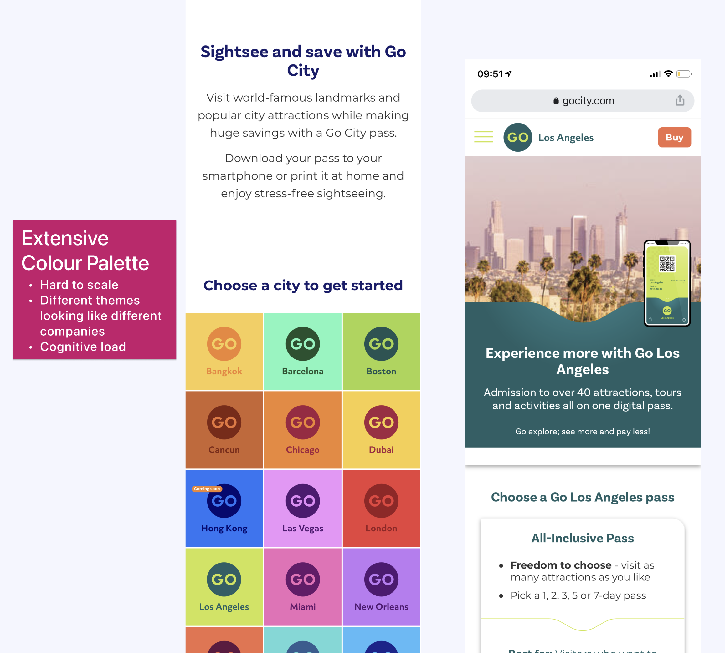
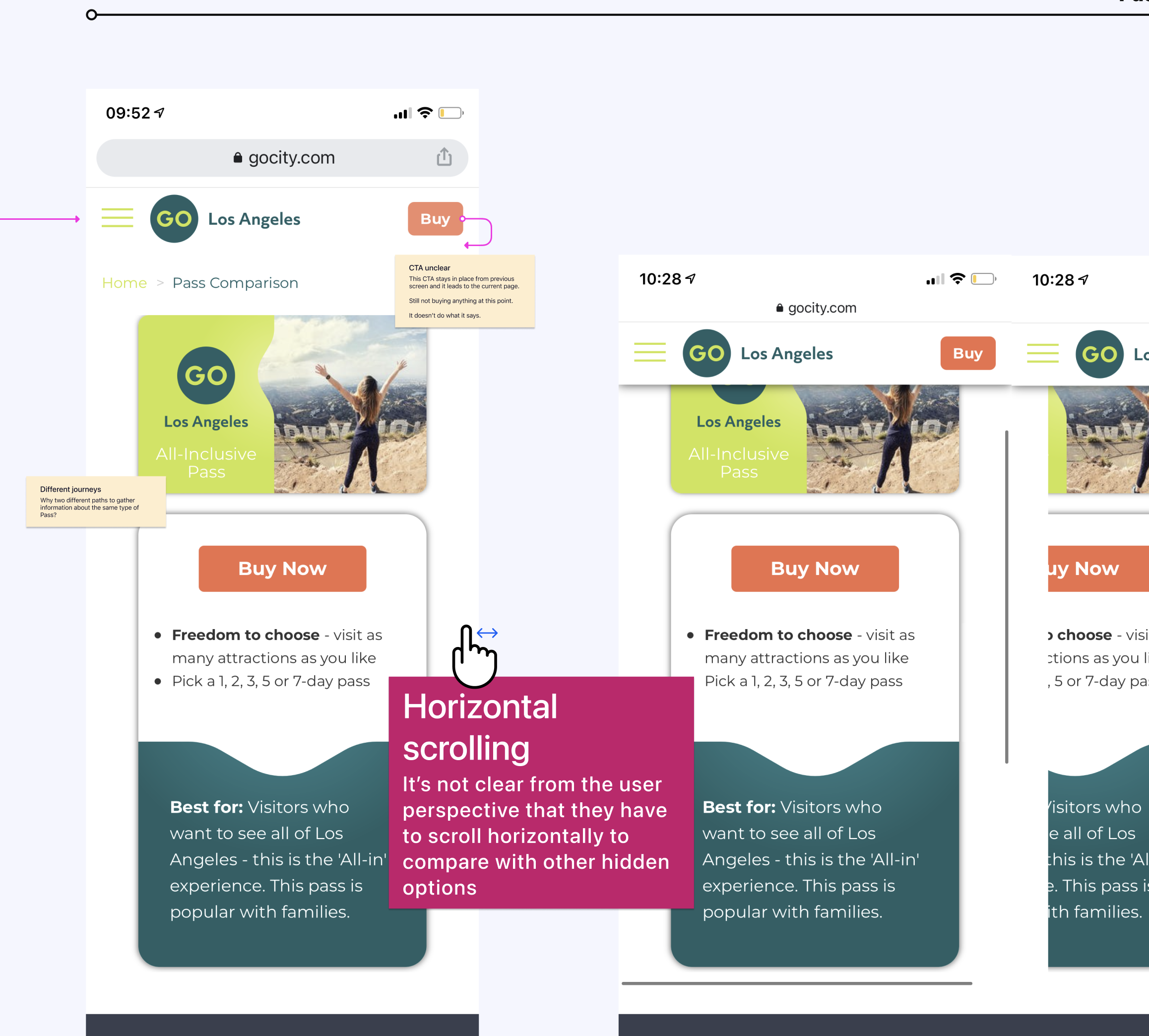


(1 & 2) Pre-redesign audit: extensive colour palette theming each city differently (scalability issues, contrast failures), brand inconsistency breaking the coherent experience, and UI issues including horizontal scrolling for pass comparison with no visual indicators for hidden content.
(3) Exploring layouts and hierarchy: testing different approaches for city homepage and attraction page to find the right balance of brand elements, content clarity, visual rhythm, and progressive information disclosure.
(4) Design system and foundation built from scratch: the design DNA that enabled faster design iteration and scalable development as new cities and features launched in subsequent phases.
What users told us when we tested
Created interactive prototypes and tested at multiple stages with 10 participants.
Key validation moments:
- Attraction-first approach: "This makes so much more sense!"
- Pass comparison: Significantly reduced confusion
- Trust signals: Noticeable increase in confidence
- Visual design: "More premium" and "easier to scan"
Critical iteration
After impression testing, we redesigned the attraction listing page, the only one still causing confusion. It tried to do too much at once, so we refocused it on attractions, added clearer filters, and made “Get Inspired” content easier to find.
The trade-off we made
Moved "Recommend a Pass" feature to backlog after testing revealed users thought shortlisted attractions were final selections, which fundamentally broke the pass model. Shipping something confusing would have been worse than not shipping it at all.
What changed
For users
- Pass options finally made sense, with confident decisions in under 30 seconds
- Attraction discovery aligned with how people actually search and plan
- Trust signals made the experience feel legitimate and premium
- App transformed from confusing to confident
For Go City
- City launch time reduced from months to weeks
- Scalable design system now powering web, mobile, and B2B platforms
- Faster, more cost-effective design and development processes
- Foundation for continuous iteration and growth

Transformation of global and city homepages: original designs with brand misalignment and accessibility issues (outer screens) versus redesigned solution with cohesive branding, accessible design, and clear content hierarchy (centre screens).
What came after launch
V2 work began immediately with "Recommended Pass," dark mode, homepage improvements, and marketing assets. The design system expanded to the newsletter (aligned with the new user journey) and blog (refreshed to inspire travel and strengthen brand connection).
If I could revisit this project
- I'd have involved content strategists earlier in the IA restructure
- I'd have documented design decisions more thoroughly for inheriting teams
- I'd have advocated for post-launch A/B testing to validate impact
What I learned
Research as the foundation
Moving from assumptions to evidence gave us confidence to make bold decisions and push back on solutions that wouldn't serve users.
Saying no is a design skill
The hardest decisions weren't about what to build, but what to build first. By mapping features against customer goals and business dependencies, we could say "not now" to good ideas to fully deliver essential ones.
Designing is orchestrating many voices
This was not only a redesign. It was a cross-team alignment effort that required guiding designers, marketing, brand, product, tech, and SEO toward a single experience vision. Co-leading the design direction taught me how critical early alignment is when many teams influence the outcome.
Principles create autonomy, not restriction
Guiding another designer through a system redesign reinforced my belief that clear principles (not rigid rules) give teams room to create confidently and consistently.
Clarity builds trust
When users understood what they were buying, they felt confident. When they didn't, they left. Trust isn't built through reassuring copy alone. It's built through clarity, consistency, and honouring what users need at each moment.
Designing for scale
Creating a flexible system with clear principles became a shared language teams across the company could speak. That shared language made everything faster.
From confusion to confidence
one city at a time.

Other work

Babylon Health
Helping new Babylon users learn, compare, and activate the right plan for their needs.
Go City
Making city exploration effortless for millions of travellers

Industry
Travel & Tourism
Services
Customer Experience Transformation, Interface Design, Design DNA
Year
2021
Platform
Website & iOS/Android App
Role
Lead Product Designer(co-leading with the UX Lead)
Created at
Reason
Team
[Reason] 3 Experience Designers/Researchers, 2 Product Designers, Product Manager[Go City] Product Owner, Brand & Marketing leads, Tech & SEO teams
Note
As of June 2022, some of this work is live, some has changed with Go City’s rebrand, and some remains under NDA until launch.
When the world's largest sightseeing pass business needed to match its digital experience to its ambition
Go City connects millions of travellers with over 1,300 attractions across 30 countries. One pass, endless possibilities: skip queues, save money, explore cities freely.
But when they approached us, there was a gap between that promise and what users were experiencing. Whilst Go City was scaling globally, their digital experience was holding them back. Users were questioning legitimacy. Pass types weren't clear. Trust wasn't there. Every city site looked different. The experience wasn't matching the excitement of discovering a new city.
That's where it got interesting. This was a chance to build something that could grow with them — a system that worked across dozens of cities, a journey that turned sceptical browsers into confident bookers, and an experience worthy of the adventures people were about to have.

Before the redesign: inconsistent city sites and unclear product messaging.
What I work on
Leading the design direction
Co-led the project, driving the visual and interaction direction across web and app, and guiding another Product Designer to ensure consistency, accessibility, and a cohesive system across platforms.
Designing the journey
Defined the end-to-end experience from discovery to purchase, shaping flows, hierarchy, and content behaviour across all customer touchpoints.
Defining the look & feel
Owned the digital evolution of Go City’s brand, translating marketing assets into an accessible, scalable, product-ready design language.
Building for scale
Created a multi-platform design system powering web, app, and B2B, enabling consistency across 30+ cities and dramatically speeding up development.
Designing for everyone
Embedded accessibility and inclusive patterns into every decision and coached the team on applying AA standards across interfaces.
Cross-functional alignment
Partnered with Brand, Marketing, Product, SEO, and Engineering to align competing priorities, drive decision-making, and ensure a unified experience across all customer-facing surfaces.
What was broken and
how we fixed it
Through customer interviews, analytics, and usability testing, we uncovered six critical problems. Here's what was broken and how we fixed it:
When two options felt like a guessing game
Users couldn't differentiate between Explorer and All-Inclusive passes or understand what they were buying.
“I don't understand the difference between these passes. What if I buy the wrong one?”
Customer, usability testing
I aligned the UX Lead, PM, and Go City stakeholders around a new direction after reviewing conflicting proposals and mapping the implications for all cities.
How we clarified it:
- Introduced a new pass selector making comparisons intuitive
- Side-by-side layouts showed price, features, and included attractions
- Made the core difference obvious: Explorer (choose X attractions) vs All-Inclusive (visit for X days).
Testing showed users could now confidently choose in
30 seconds
The redesigned pass exploration flow helping users compare options and understand exactly what they're buying.
Giving people what they actually came for
SEO and research showed people searched for specific attractions, not passes, but the site led with passes anyway, forcing users to work backwards.
"I want to know what attractions I can visit,then decide if a pass is worth it.”
Customer, usability testing
I facilitated alignment between Brand, SEO, and Product teams to prioritise clarity over marketing density and reshape the IA around real user intent.
How we redesigned it:
- Rebuilt the IA to put attractions at the centre
- Immediate access to all attractions with filtering by category and location
- Introduced curated itineraries for inspiration
- Added clear pass indicators to each attraction to clarify pass eligibility
It aligned with how people actually think: “I want to visit attractions. A pass is just the best way to do it.”

The redesigned city homepage: brief pass overview at the top, then attractions front and centre with clear pass indicators, curated itineraries for inspiration, and filtering by category and location.
When buried reviews were killing confidence
Hidden reviews, unclear terms, and no transparency around booking requirements made the experience feel untrustworthy.
"How do I know this isn't a scam? The reviews feel hidden and the terms are confusing.”
Customer, usability testing
I worked with Brand, Legal, and Marketing stakeholders to prioritise transparency over promotional copy and redesign trust moments across the funnel.
How we rebuilt trust:
- Redesigned Trustpilot integration with proper hierarchy
- Introduced “Buy with Confidence” modules (90-day cancellation, customer service)
- Added detailed “What’s Included / Not Included” sections
- Made terms and requirements clear with proper hierarchy
- Strengthened security signals throughout checkout.

Three moments of reassurance: (1) What's included and what to know in advance, (2) "Buy with Confidence" with 90-day guarantee and prominent Trustpilot reviews, (3) clear terms and security signals at checkout.
When every city felt like a different company
Inconsistent layouts across cities, poor hierarchy, and buried details made basic information hard to find.
I guided our second designer through component explorations and ensured each proposal aligned with the emerging design system and accessibility principles.
Our approach to unifying the experience:
- Built a modular component library working across 30+ cities
- Unified navigation, harmonised layouts, colour, and typography.
New cities could be launched in weeks, not months, whilst maintaining consistency.

Scalable consistency across 30+ cities with unified navigation and layout, flexible for each destination's unique content.
Making the app feel like a travel companion, not a question mark
Users didn't know if their pass was active, when it would activate, or how to use it at attractions.
I coordinated with Product and Engineering to define information timing and ensure critical details surfaced at the right moment in the app journey.
How we improved the app experience:
- Clear onboarding explaining pass activation
- Easy attraction discovery (filtering, maps, favourites)
- Booking requirements and hours shown upfront
- Personality through warm empty states and encouraging tone.


(1) App redesign across key journeys: pass download with clear error handling and confirmation, favourites for saving attractions and itineraries (with warm empty states inviting users to start exploring), map view for location-based discovery, filtered attraction lists (nearby, open now, categories), and favourites organised by city for easy trip planning.
(2) Pass activation clarity: passes remain inactive after download until scanned at the first attraction. Clear messaging confirms activation and shows validity period based on pass type.
(3) Adding personality: favourite button animation concept bringing character to user interactions.
Beautiful and functional, not one or the other
Brand colours and fonts looked great in marketing but created contrast failures, readability issues, and no guidance for interactive states in digital products.
This wasn’t just an IA problem. The visual design was undermining user confidence at every turn, and it required leading with strong design direction and aligning Brand & Marketing on necessary adjustments for usability.
How I evolved the look & feel and led the visual system transformation:
- Adjusted brand colours for WCAG AA compliance whilst maintaining recognition
- Optimised typography for screen readability
- Created photography and illustration guidelines for digital
- Systematised every component with brand purpose and accessibility.
Users described the redesign as "more premium" and "more trustworthy”


(1 & 2) Pre-redesign audit: extensive colour palette theming each city differently (scalability issues, contrast failures), brand inconsistency breaking the coherent experience, and UI issues including horizontal scrolling for pass comparison with no visual indicators for hidden content.
(3) Exploring layouts and hierarchy: testing different approaches for city homepage and attraction page to find the right balance of brand elements, content clarity, visual rhythm, and progressive information disclosure.
(4) Design system and foundation built from scratch: the design DNA that enabled faster design iteration and scalable development as new cities and features launched in subsequent phases.
What users told uswhen we tested
Created interactive prototypes and tested at multiple stages with 10 participants.
Key validation moments:
- Attraction-first approach: "This makes so much more sense!"
- Pass comparison: Significantly reduced confusion
- Trust signals: Noticeable increase in confidence
- Visual design: "More premium" and "easier to scan"
Critical iteration
After impression testing, we redesigned the attraction listing page, the only one still causing confusion. It tried to do too much at once, so we refocused it on attractions, added clearer filters, and made “Get Inspired” content easier to find.
The trade-off we made
Moved "Recommend a Pass" feature to backlog after testing revealed users thought shortlisted attractions were final selections, which fundamentally broke the pass model. Shipping something confusing would have been worse than not shipping it at all.
What changed
For users
- Pass options finally made sense, with confident decisions in under 30 seconds
- Attraction discovery aligned with how people actually search and plan
- Trust signals made the experience feel legitimate and premium
- App transformed from confusing to confident
For Go City
- City launch time reduced from months to weeks
- Scalable design system now powering web, mobile, and B2B platforms
- Faster, more cost-effective design and development processes
- Foundation for continuous iteration and growth

Transformation of global and city homepages: original designs with brand misalignment and accessibility issues (outer screens) versus redesigned solution with cohesive branding, accessible design, and clear content hierarchy (centre screens).
What came after launch
V2 work began immediately with "Recommended Pass," dark mode, homepage improvements, and marketing assets. The design system expanded to the newsletter (aligned with the new user journey) and blog (refreshed to inspire travel and strengthen brand connection).
If I could revisit this project
- I'd have involved content strategists earlier in the IA restructure
- I'd have documented design decisions more thoroughly for inheriting teams
- I'd have advocated for post-launch A/B testing to validate impact
What I learned
Research as the foundation
Moving from assumptions to evidence gave us confidence to make bold decisions and push back on solutions that wouldn't serve users.
Saying no is a design skill
The hardest decisions weren't about what to build, but what to build first. By mapping features against customer goals and business dependencies, we could say "not now" to good ideas to fully deliver essential ones.
Designing is orchestrating many voices
This was not only a redesign. It was a cross-team alignment effort that required guiding designers, marketing, brand, product, tech, and SEO toward a single experience vision. Co-leading the design direction taught me how critical early alignment is when many teams influence the outcome.
Principles create autonomy, not restriction
Guiding another designer through a system redesign reinforced my belief that clear principles (not rigid rules) give teams room to create confidently and consistently.
Clarity builds trust
When users understood what they were buying, they felt confident. When they didn't, they left. Trust isn't built through reassuring copy alone. It's built through clarity, consistency, and honouring what users need at each moment.
Designing for scale
Creating a flexible system with clear principles became a shared language teams across the company could speak. That shared language made everything faster.
From confusion to confidence
one city at a time.
