NatWestMobile Banking
NatWest Mobile Banking app is used by over 6 million people every day. We delivered a refreshed brand experience and expanded what customers could do, anytime, anywhere, right from their pocket.

Industry
Digital banking
Services
Interface Design, Design DNA
Year
2018
The crew & the stage
What I work on
Cross-platform feature design
Designed new features and updates for iOS and Android platforms
Visual asset creation
Created custom iconography and visual assets to extend NatWest's existing illustration system
Design system overhaul
Led a comprehensive rebuild of the design system and Sketch library
Challenging conventions
Explored alternative interaction patterns that challenged default native behaviours when they didn't serve our users
Designing at scale in a competitive market
NatWest's mobile banking app serves over 6 million people across the UK every day. Mobile banking in the UK is fiercely competitive. Every update matters, every interaction needs to feel effortless, and every design decision impacts millions of daily transactions. Working as part of Publicis Sapient alongside NatWest's digital team, we faced three core challenges:
- Platform complexity – Designing features that work seamlessly across iPhone, iPad, and Android whilst respecting each platform's conventions
- Rapid iteration – Shipping new features regularly to keep pace with market competition
- Brand alignment – Maintaining NatWest's visual identity whilst modernising the experience
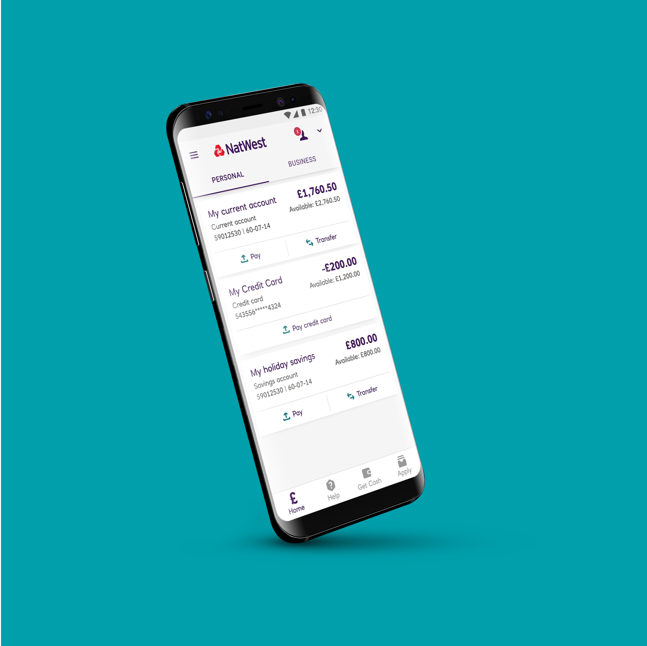
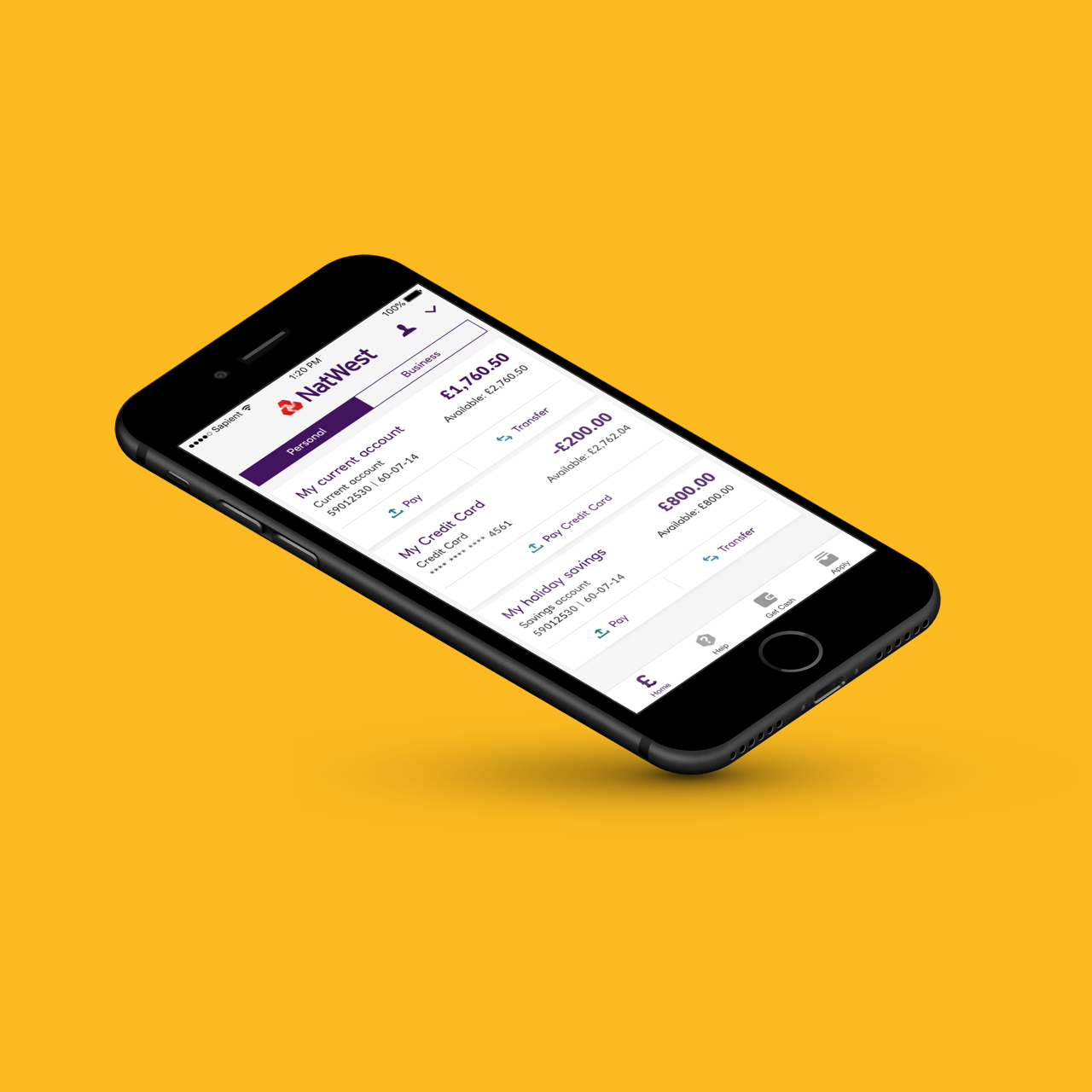
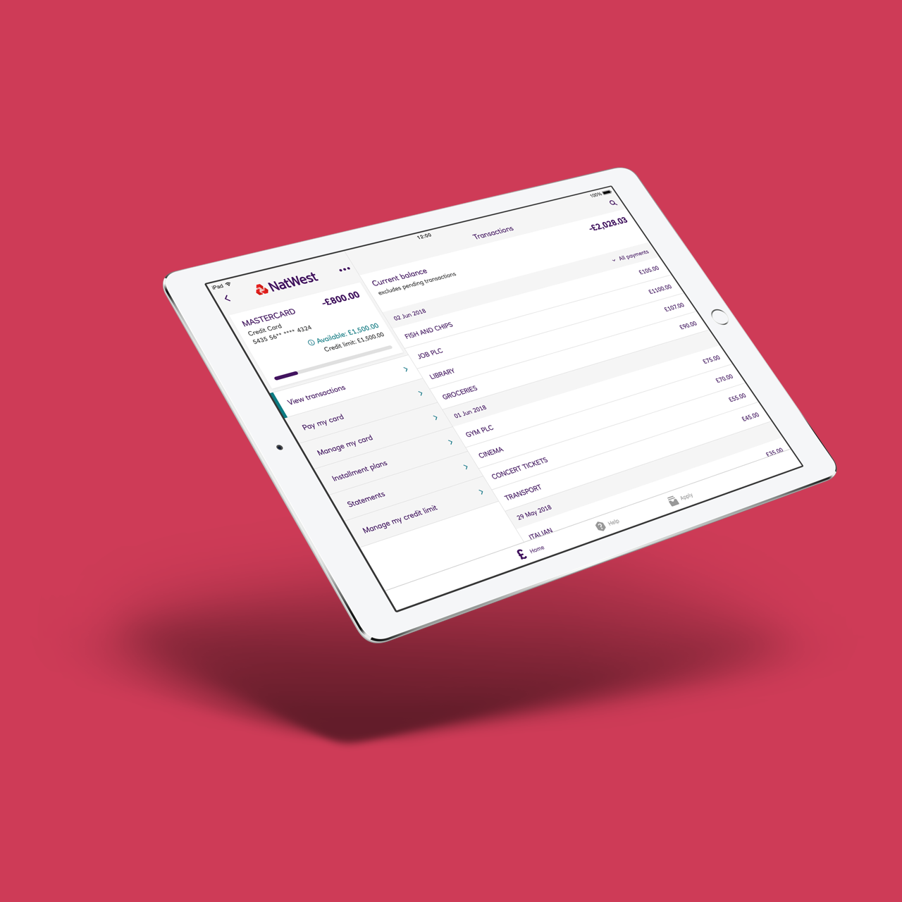
The NatWest app works across iPhone, iPad, and Android. Each feature needed to be designed specifically for each platform, which gave me invaluable experience designing for both iOS and Android systems at scale, understanding not just the technical differences but the nuanced expectations users have on each platform.
What was broken and how we fixed it
Introducing installment plans
One of the most significant features I worked on was Installment Plans, a tool allowing customers to split purchases into manageable payments. This required careful consideration of information architecture, discoverability, and how to keep the experience clear without overwhelming users with financial jargon.
The challenge was making it intuitive for first-time users whilst providing enough control for those managing multiple plans simultaneously.
Making financial flexibility transparent. Customers can compare installment options, see exact costs and interest rates, and understand what they're committing to before choosing a plan.
Breaking conventions for better experiences
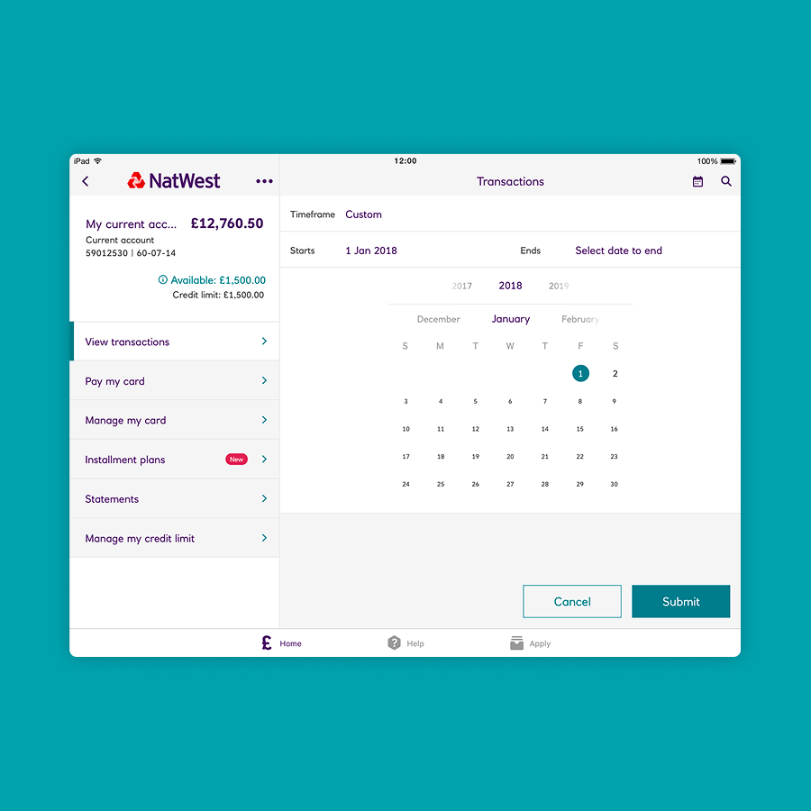
Native platform components are designed to be familiar, but familiarity doesn't always equal usability. I explored alternatives to default iOS and Android functionalities when they didn't serve our specific needs, improving clarity and balance within layouts whilst maintaining alignment with NatWest's brand values.
Each deviation from convention required clear rationale to ensure we weren't sacrificing usability for aesthetics.
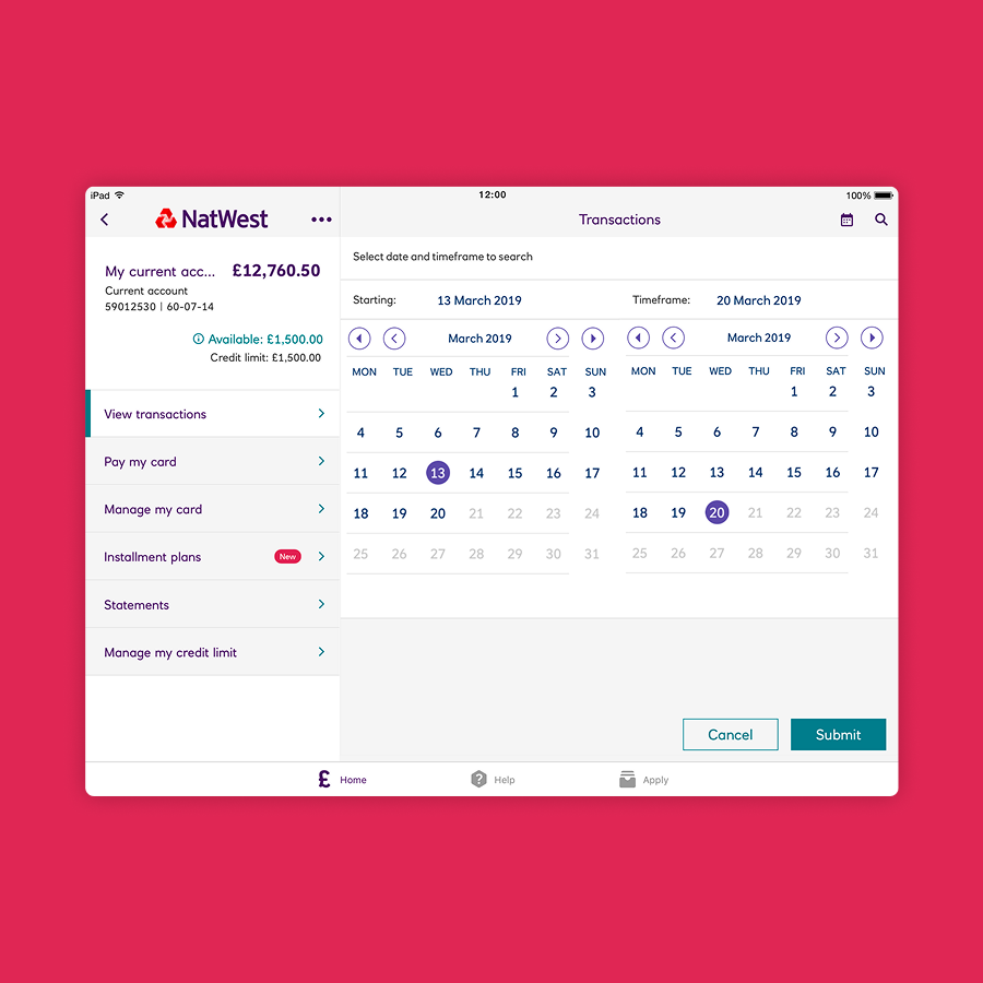
Before and after redesign
Creating icons that need no explanation
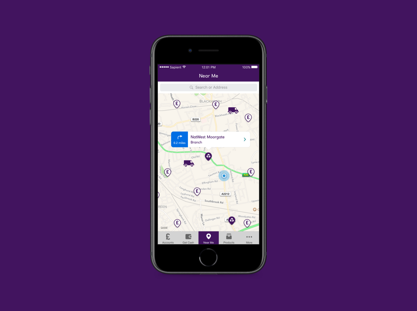
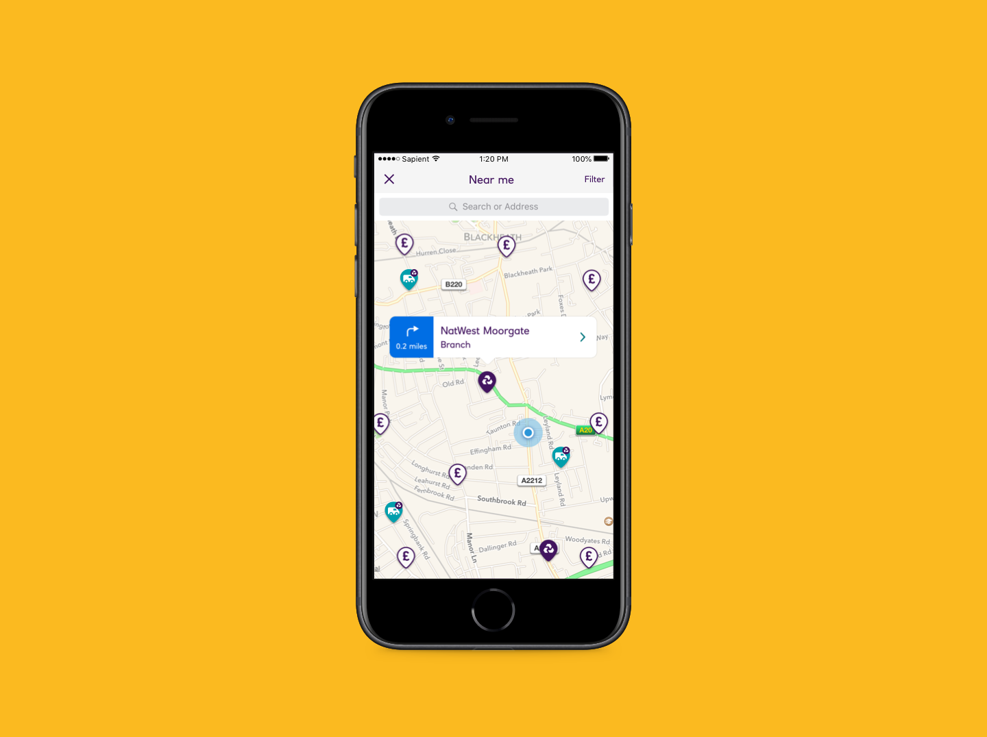
NatWest's brand came with a rich library of illustrations and icons, but new features created gaps. I designed additional icons to maintain visual consistency, including a branch locator icon that needed to communicate physical location whilst fitting seamlessly into the existing style.
Creating icons for a banking app demands instant recognisability and zero ambiguity. There's no room for creative interpretation when someone's managing their finances.
Before and after redesign
The temporary branch van looked like a moving vehicle on maps. Placing it within a pin clarified it as a fixed location, matched existing branch icons, and maintained flexibility for other RBS brands.
What users told us when we tested
Building a dynamic Sketch library
One of my key contributions was overhauling the existing component library. The previous setup worked, but wasn't optimised for the speed our team needed when designing across multiple platforms and brands (NatWest is part of the RBS Group, which includes Royal Bank of Scotland and Ulster Bank).
I rebuilt the library with two priorities:
Pixel-perfect precision – Every component needed to match development specifications exactly, eliminating ambiguity during handoff and reducing back-and-forth with engineers.
Dynamic flexibility – Components adapted intelligently. Changing a button's label automatically adjusted its width. Selecting a different platform swapped appropriate styling. This meant adapting designs for iOS versus Android, or NatWest versus RBS branding, became minutes rather than hours.
The result was a design system that actively accelerated our workflow whilst maintaining the strict consistency a financial app demands.
Dynamic Sketch components in action: adapting across screen sizes, content, and brand colours without breaking. This modular approach helped us design faster while keeping strict consistency across the app and RBS Group brands.
Note from the future
Looking at this in 2025, this workflow feels dated now, although it was a real leap forward in 2018. Today, tools like Figma bring Auto Layout, Variants and Variables, which make componentisation far more seamless and collaborative.
With AI now reshaping our workflows, I’m excited about how much more time designers will be able to spend on craft, clarity and experience, and how design-to-development will continue to evolve.
What I learned
Designing for 6 million daily users taught me humility quickly. Every decision I made eventually encountered edge cases I didn't consider. Every pattern I established was tested by real people in stressful moments: checking their balance before a purchase, transferring money urgently, managing finances during difficult times.
This work deepened my understanding of:
Platform nuance
It's not just about following iOS and Android guidelines; it's about understanding why those guidelines exist and when our specific context might warrant a different approach.
Systematic thinking
At this scale, individual screen designs matter less than the patterns and components that compound across the entire experience.
Craft within constraints
Banking apps operate within strict regulatory, technical, and brand constraints. Finding opportunities for improved usability and visual refinement within those boundaries became a constant creative challenge.
Impact
The NatWest app has won multiple awards and serves millions of customers daily.
- Installment Plans don’t just help manage larger purchases, they give people clarity and help them choose the option that best fits their financial needs.
- My contribution to the design system accelerated the entire team's workflow.
- This project reshaped my understanding of how design systems should work and how to build them consistently across platforms.
Reflection
I'll be honest: I used to step back from working for banks, assuming I could make a better impact elsewhere. When this opportunity came up, I was drawn to NatWest's distinct brand. It felt like a "cool bank" compared to traditional competitors. But I didn't anticipate how this work would shift my perspective.
Making installment plans clearer and designing transparent financial interactions directly impact how people manage money and make choices that affect their lives. When I design clarity that helps someone understand if they can afford a purchase, that matters beyond the screen.
Banking is one of the most consequential spaces to work in. The impact on people's financial wellbeing makes every detail worth it.
The best moments weren't always the flashiest features. Sometimes it was a calendar that felt right, an icon that needed no explanation, an installment plan flow that made financial flexibility understandable. Those small craft decisions, multiplied across millions of interactions, matter as much as the big launches.
Other work
Babylon Health
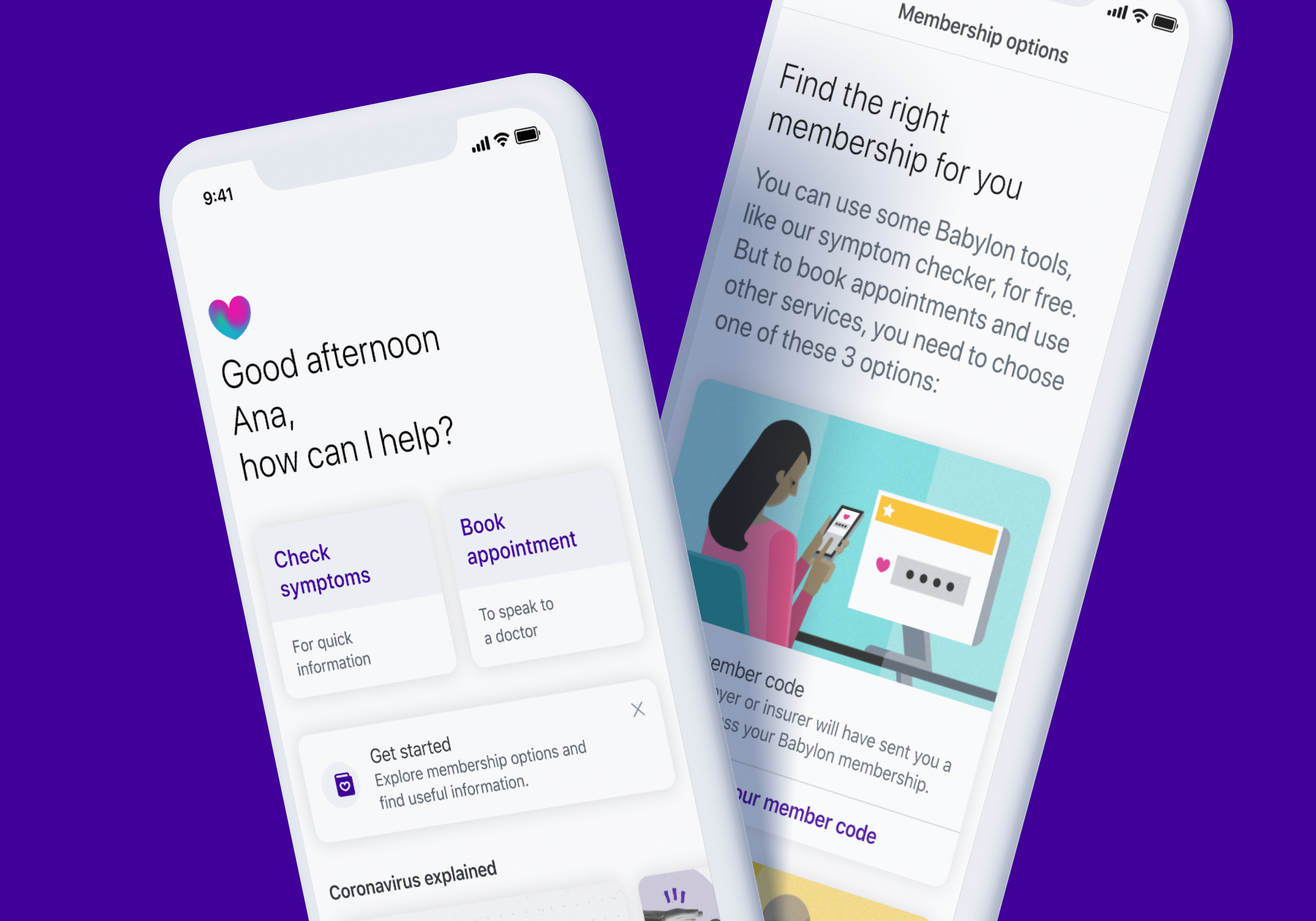
Helping new Babylon users learn, compare, and activate the right plan for their needs.
Go City
Transforming Go City's digital experience to help travellers discover, plan, and buy with confidence
NatWestMobile Banking
NatWest Mobile Banking app is used by over 6 million people every day.We delivered a refreshed brand experience and expanded what customers could do, anytime, anywhere, right from their pocket.


Industry
Digital banking
Services
Interface Design, Design DNA
Year
2018
Platform
iOS/Android App
Role
UI Designer
Created at
Publicis Sapient
Team
UX Design Lead, 2 UX designers, 2 UI designers, iOS & Android Engineers
What I work on
Cross-platform feature design
Designed new features and updates for iOS and Android platforms
Visual asset creation
Created custom iconography and visual assets to extend NatWest's existing illustration system
Design system overhaul
Led a comprehensive rebuild of the design system and Sketch library
Challenging conventions
Explored alternative interaction patterns that challenged default native behaviours when they didn't serve our users
Designing at scale in a competitive market
NatWest's mobile banking app serves over 6 million people across the UK every day. Mobile banking in the UK is fiercely competitive. Every update matters, every interaction needs to feel effortless, and every design decision impacts millions of daily transactions. Working as part of Publicis Sapient alongside NatWest's digital team, we faced three core challenges:
- Platform complexity – Designing features that work seamlessly across iPhone, iPad, and Android whilst respecting each platform's conventions
- Rapid iteration – Shipping new features regularly to keep pace with market competition
- Brand alignment – Maintaining NatWest's visual identity whilst modernising the experience
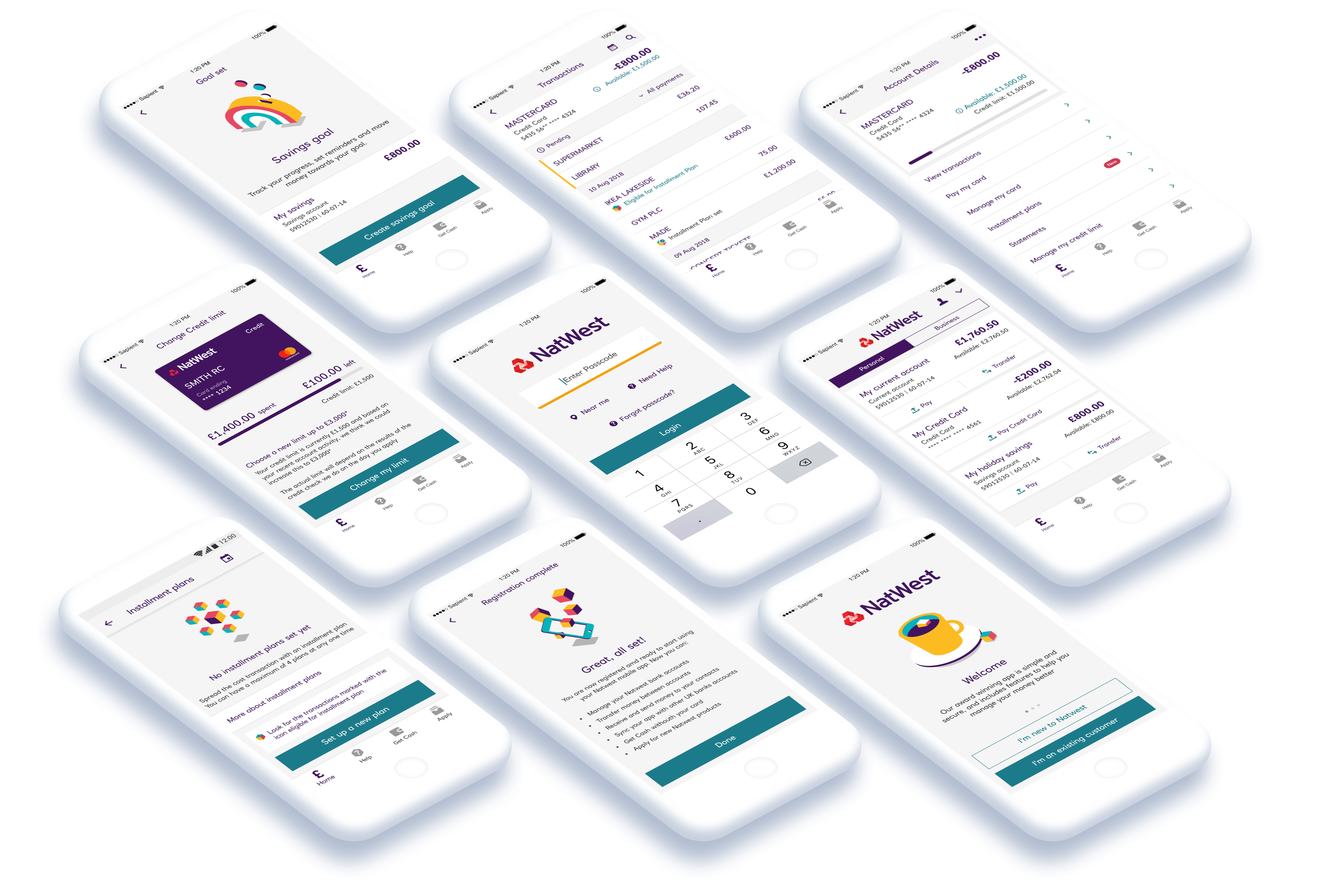


The NatWest app works across iPhone, iPad, and Android. Each feature needed to be designed specifically for each platform, which gave me invaluable experience designing for both iOS and Android systems at scale, understanding not just the technical differences but the nuanced expectations users have on each platform.
What was broken and how we fixed it
Introducing installment plans
One of the most significant features I worked on was Installment Plans, a tool allowing customers to split purchases into manageable payments. This required careful consideration of information architecture, discoverability, and how to keep the experience clear without overwhelming users with financial jargon.
The challenge was making it intuitive for first-time users whilst providing enough control for those managing multiple plans simultaneously.
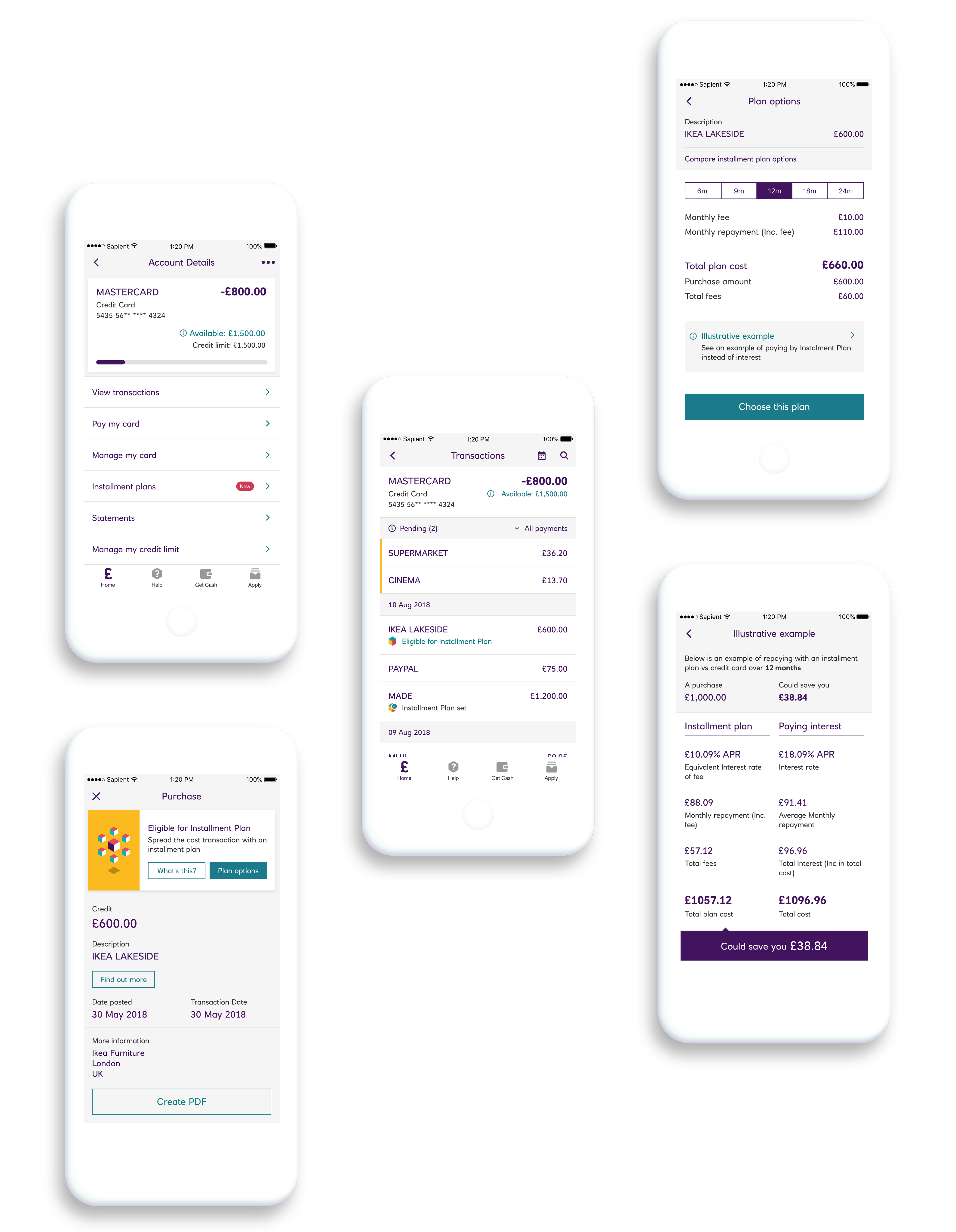
Making financial flexibility transparent. Customers can compare installment options, see exact costs and interest rates, and understand what they're committing to before choosing a plan.
Breaking conventions for better experiences
Native platform components are designed to be familiar, but familiarity doesn't always equal usability. I explored alternatives to default iOS and Android functionalities when they didn't serve our specific needs, improving clarity and balance within layouts whilst maintaining alignment with NatWest's brand values.
Each deviation from convention required clear rationale to ensure we weren't sacrificing usability for aesthetics.


Before
After redesign
Creating icons that need no explanation
NatWest's brand came with a rich library of illustrations and icons, but new features created gaps. I designed additional icons to maintain visual consistency, including a branch locator icon that needed to communicate physical location whilst fitting seamlessly into the existing style.
Creating icons for a banking app demands instant recognisability and zero ambiguity. There's no room for creative interpretation when someone's managing their finances.


Before
After redesign
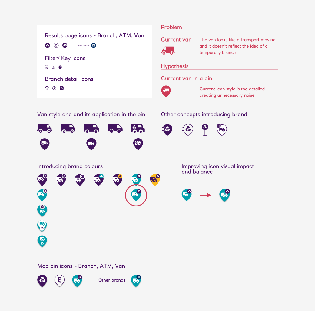
The temporary branch van looked like a moving vehicle on maps. Placing it within a pin clarified it as a fixed location, matched existing branch icons, and maintained flexibility for other RBS brands.
What users told us when we tested
Building a dynamic Sketch library
One of my key contributions was overhauling the existing component library. The previous setup worked, but wasn't optimised for the speed our team needed when designing across multiple platforms and brands (NatWest is part of the RBS Group, which includes Royal Bank of Scotland and Ulster Bank).
I rebuilt the library with two priorities:
Pixel-perfect precision – Every component needed to match development specifications exactly, eliminating ambiguity during handoff and reducing back-and-forth with engineers.
Dynamic flexibility – Components adapted intelligently. Changing a button's label automatically adjusted its width. Selecting a different platform swapped appropriate styling. This meant adapting designs for iOS versus Android, or NatWest versus RBS branding, became minutes rather than hours.
The result was a design system that actively accelerated our workflow whilst maintaining the strict consistency a financial app demands.
Dynamic Sketch components in action: adapting across screen sizes, content, and brand colours without breaking. This modular approach helped us design faster while keeping strict consistency across the app and RBS Group brands.
Note from the future
Looking at this in 2025, this workflow feels dated now, although it was a real leap forward in 2018. Today, tools like Figma bring Auto Layout, Variants and Variables, which make componentisation far more seamless and collaborative.
With AI now reshaping our workflows, I’m excited about how much more time designers will be able to spend on craft, clarity and experience, and how design-to-development will continue to evolve.
What I learned
Designing for 6 million daily users taught me humility quickly. Every decision I made eventually encountered edge cases I didn't consider. Every pattern I established was tested by real people in stressful moments: checking their balance before a purchase, transferring money urgently, managing finances during difficult times.
This work deepened my understanding of:
Platform nuance
It's not just about following iOS and Android guidelines; it's about understanding why those guidelines exist and when our specific context might warrant a different approach.
Systematic thinking
At this scale, individual screen designs matter less than the patterns and components that compound across the entire experience.
Craft within constraints
Banking apps operate within strict regulatory, technical, and brand constraints. Finding opportunities for improved usability and visual refinement within those boundaries became a constant creative challenge.
Impact
The NatWest app has won multiple awards and serves millions of customers daily.
- Installment Plans don’t just help manage larger purchases, they give people clarity and help them choose the option that best fits their financial needs.
- My contribution to the design system accelerated the entire team's workflow.
- This project reshaped my understanding of how design systems should work and how to build them consistently across platforms.
Reflection
I'll be honest: I used to step back from working for banks, assuming I could make a better impact elsewhere. When this opportunity came up, I was drawn to NatWest's distinct brand. It felt like a "cool bank" compared to traditional competitors. But I didn't anticipate how this work would shift my perspective.
Making installment plans clearer and designing transparent financial interactions directly impact how people manage money and make choices that affect their lives. When I design clarity that helps someone understand if they can afford a purchase, that matters beyond the screen.
Banking is one of the most consequential spaces to work in. The impact on people's financial wellbeing makes every detail worth it.
The best moments weren't always the flashiest features. Sometimes it was a calendar that felt right, an icon that needed no explanation, an installment plan flow that made financial flexibility understandable. Those small craft decisions, multiplied across millions of interactions, matter as much as the big launches.
Other work

Babylon Health
Helping new Babylon users learn, compare, and activate the right plan for their needs.

Go City
Transforming Go City's digital experience to help travellers discover, plan, and buy with confidence
NatWestMobile Banking
NatWest Mobile Banking app is used by over 6 million people every day.We delivered a refreshed brand experience and expanded what customers could do, anytime, anywhere, right from their pocket.


Industry
Digital banking
Services
Interface Design, Design DNA
Year
2018
Platform
iOS/Android App
Role
UI Designer
Created at
Publicis Sapient
Team
UX Design Lead, 2 UX designers, 2 UI designers, iOS & Android Engineers
What I work on
Cross-platform feature design
Designed new features and updates for iOS and Android platforms
Visual asset creation
Created custom iconography and visual assets to extend NatWest's existing illustration system
Design system overhaul
Led a comprehensive rebuild of the design system and Sketch library
Challenging conventions
Explored alternative interaction patterns that challenged default native behaviours when they didn't serve our users
Designing at scale in a competitive market
NatWest's mobile banking app serves over 6 million people across the UK every day. Mobile banking in the UK is fiercely competitive. Every update matters, every interaction needs to feel effortless, and every design decision impacts millions of daily transactions. Working as part of Publicis Sapient alongside NatWest's digital team, we faced three core challenges:
- Platform complexity – Designing features that work seamlessly across iPhone, iPad, and Android whilst respecting each platform's conventions
- Rapid iteration – Shipping new features regularly to keep pace with market competition
- Brand alignment – Maintaining NatWest's visual identity whilst modernising the experience


The NatWest app works across iPhone, iPad, and Android. Each feature needed to be designed specifically for each platform, which gave me invaluable experience designing for both iOS and Android systems at scale, understanding not just the technical differences but the nuanced expectations users have on each platform.
Shipping features that matter
Introducing installment plans
One of the most significant features I worked on was Installment Plans, a tool allowing customers to split purchases into manageable payments. This required careful consideration of information architecture, discoverability, and how to keep the experience clear without overwhelming users with financial jargon.
The challenge was making it intuitive for first-time users whilst providing enough control for those managing multiple plans simultaneously.

Making financial flexibility transparent. Customers can compare installment options, see exact costs and interest rates, and understand what they're committing to before choosing a plan.
Breaking conventions for better experiences
Native platform components are designed to be familiar, but familiarity doesn't always equal usability. I explored alternatives to default iOS and Android functionalities when they didn't serve our specific needs, improving clarity and balance within layouts whilst maintaining alignment with NatWest's brand values.
Each deviation from convention required clear rationale to ensure we weren't sacrificing usability for aesthetics.


Before
After redesign
Creating icons that need no explanation
NatWest's brand came with a rich library of illustrations and icons, but new features created gaps. I designed additional icons to maintain visual consistency, including a branch locator icon that needed to communicate physical location whilst fitting seamlessly into the existing style.
Creating icons for a banking app demands instant recognisability and zero ambiguity. There's no room for creative interpretation when someone's managing their finances.


Before
After redesign

The temporary branch van looked like a moving vehicle on maps. Placing it within a pin clarified it as a fixed location, matched existing branch icons, and maintained flexibility for other RBS brands.
Rebuilding the foundation
Building a dynamic Sketch library
One of my key contributions was overhauling the existing component library. The previous setup worked, but wasn't optimised for the speed our team needed when designing across multiple platforms and brands (NatWest is part of the RBS Group, which includes Royal Bank of Scotland and Ulster Bank).
I rebuilt the library with two priorities:
Pixel-perfect precision – Every component needed to match development specifications exactly, eliminating ambiguity during handoff and reducing back-and-forth with engineers.
Dynamic flexibility – Components adapted intelligently. Changing a button's label automatically adjusted its width. Selecting a different platform swapped appropriate styling. This meant adapting designs for iOS versus Android, or NatWest versus RBS branding, became minutes rather than hours.
The result was a design system that actively accelerated our workflow whilst maintaining the strict consistency a financial app demands.
Dynamic Sketch components in action: adapting across screen sizes, content, and brand colours without breaking. This modular approach helped us design faster while keeping strict consistency across the app and RBS Group brands.
Note from the future
Looking at this in 2025, this workflow feels dated now, although it was a real leap forward in 2018. Today, tools like Figma bring Auto Layout, Variants and Variables, which make componentisation far more seamless and collaborative.
With AI now reshaping our workflows, I’m excited about how much more time designers will be able to spend on craft, clarity and experience, and how design-to-development will continue to evolve.
What I learned
Designing for 6 million daily users taught me humility quickly. Every decision I made eventually encountered edge cases I didn't consider. Every pattern I established was tested by real people in stressful moments: checking their balance before a purchase, transferring money urgently, managing finances during difficult times.
This work deepened my understanding of:
Platform nuance
It's not just about following iOS and Android guidelines; it's about understanding why those guidelines exist and when our specific context might warrant a different approach.
Systematic thinking
At this scale, individual screen designs matter less than the patterns and components that compound across the entire experience.
Craft within constraints
Banking apps operate within strict regulatory, technical, and brand constraints. Finding opportunities for improved usability and visual refinement within those boundaries became a constant creative challenge.
Impact
The NatWest app has won multiple awards and serves millions of customers daily.
- Installment Plans don’t just help manage larger purchases, they give people clarity and help them choose the option that best fits their financial needs.
- My contribution to the design system accelerated the entire team's workflow.
- This project reshaped my understanding of how design systems should work and how to build them consistently across platforms.
Reflection
I'll be honest: I used to step back from working for banks, assuming I could make a better impact elsewhere. When this opportunity came up, I was drawn to NatWest's distinct brand. It felt like a "cool bank" compared to traditional competitors. But I didn't anticipate how this work would shift my perspective.
Making installment plans clearer and designing transparent financial interactions directly impact how people manage money and make choices that affect their lives. When I design clarity that helps someone understand if they can afford a purchase, that matters beyond the screen.
Banking is one of the most consequential spaces to work in. The impact on people's financial wellbeing makes every detail worth it.
The best moments weren't always the flashiest features. Sometimes it was a calendar that felt right, an icon that needed no explanation, an installment plan flow that made financial flexibility understandable. Those small craft decisions, multiplied across millions of interactions, matter as much as the big launches.