Babylon Health
Guiding new members from sign-up to their first appointment
Industry
Health tech
Services
UX/UI Design, User Research & Testing
Year
2020
The crew & the stage
Sign-ups surged.Activation didn't.
Babylon Health was a digital healthcare platform offering AI-powered health tools, virtual GP appointments, and wellness tracking across the UK, US, and Rwanda. When COVID-19 hit, sign-ups surged. But 62% of new users never activated their accounts within 30 days.
The app dropped users onto a home screen that offered little value after sign-up. Generic content cards and quick actions provided no guidance about what Babylon offered, how appointments worked, or which membership plan suited their needs. Users were left to figure it out alone, and most simply didn't.
Babylon was spending more to acquire users, but most were leaving before ever experiencing the value of the service. We needed to turn those first confusing moments into confident ones.
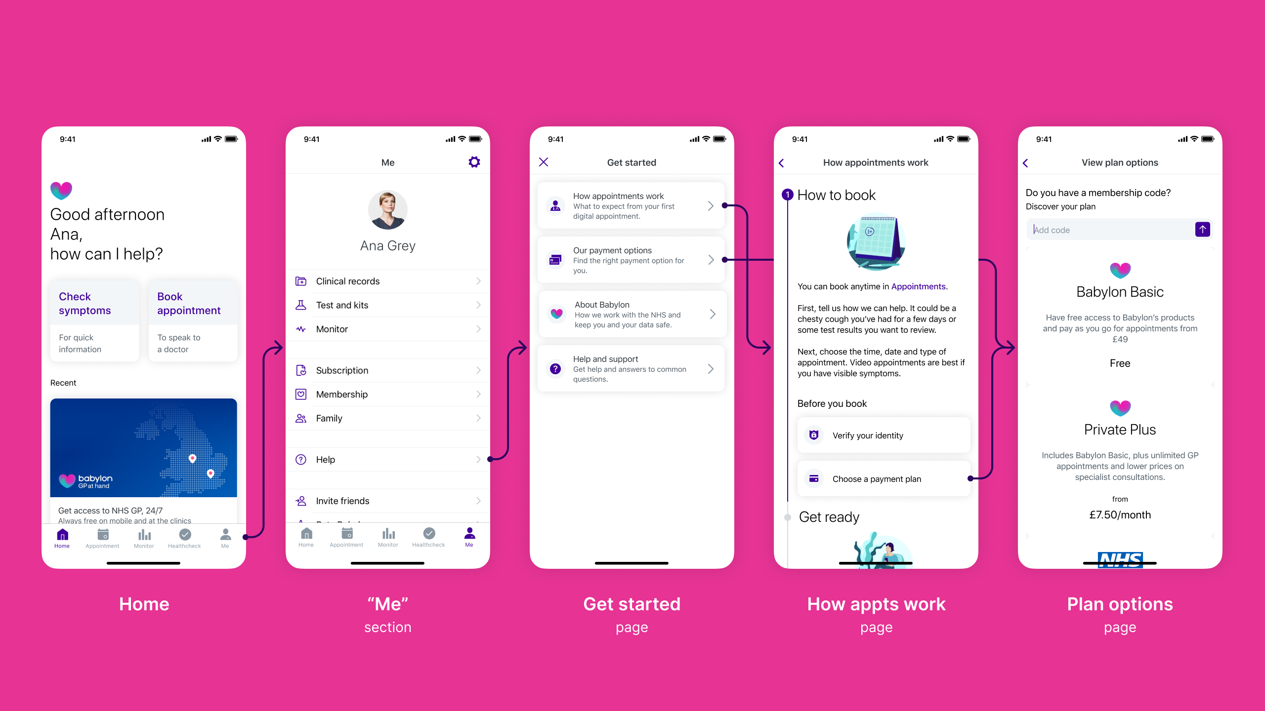
Before redesign: Users landed on a home screen with no clear guidance, then had to navigate "Me" > "Help" to find plan information. Inconsistent labelling ("Get started" vs "Help"), unclear distinctions between membership types and payment options, and information revealed at the wrong moments created confusion throughout the journey.
Impact after redesign
Under 2 minutes
previously confused users made confident decisions, unlocking activation for 62% of drop-offs.
Outcomes
What I work on
Translating research into design decisions
Collaborated with researchers through multiple testing rounds, converting insights into specific design interventions.
Designing the onboarding flow
Designed the UI for a "Getting Started" guide, shaping how new users would discover services, compare membership options, and take their first action.
Working within design system constraints
Applied Babylon's design system consistently whilst proposing targeted updates to support new onboarding patterns across iOS and Android.
Rapid iteration through testing
Used RITE methodology implementing changes between sessions to validate improvements quickly.
What was broken and how we fixed it
Through analytics, customer service data, and usability testing, we uncovered three critical problems blocking activation:
New users had nowhere to go
Drop-off rates within the first 30 days were significantly high. Users landed on a home screen with no clear path forward, no sense of what Babylon offered, or how anything worked.
"I don't know where to go from here. What am I supposed to do?"
Prospective user, usability testing
What we did:
- Introduced a dismissible "Getting Started" guide visible on the home screen, inviting exploration without blocking core functionality
- Created an always-accessible entry point in the user's profile
- Organised information into clear, interactive steps: compare membership options, understand what's included, activate a plan or explore the app, book appointments or try health tools
- Made each section progressively informative, starting with high-level overviews, then revealing detail on demand
Working closely with content design throughout, we ensured every headline, sentence, and piece of information supported understanding and trust whilst being delivered at exactly the right moment in the user's journey.
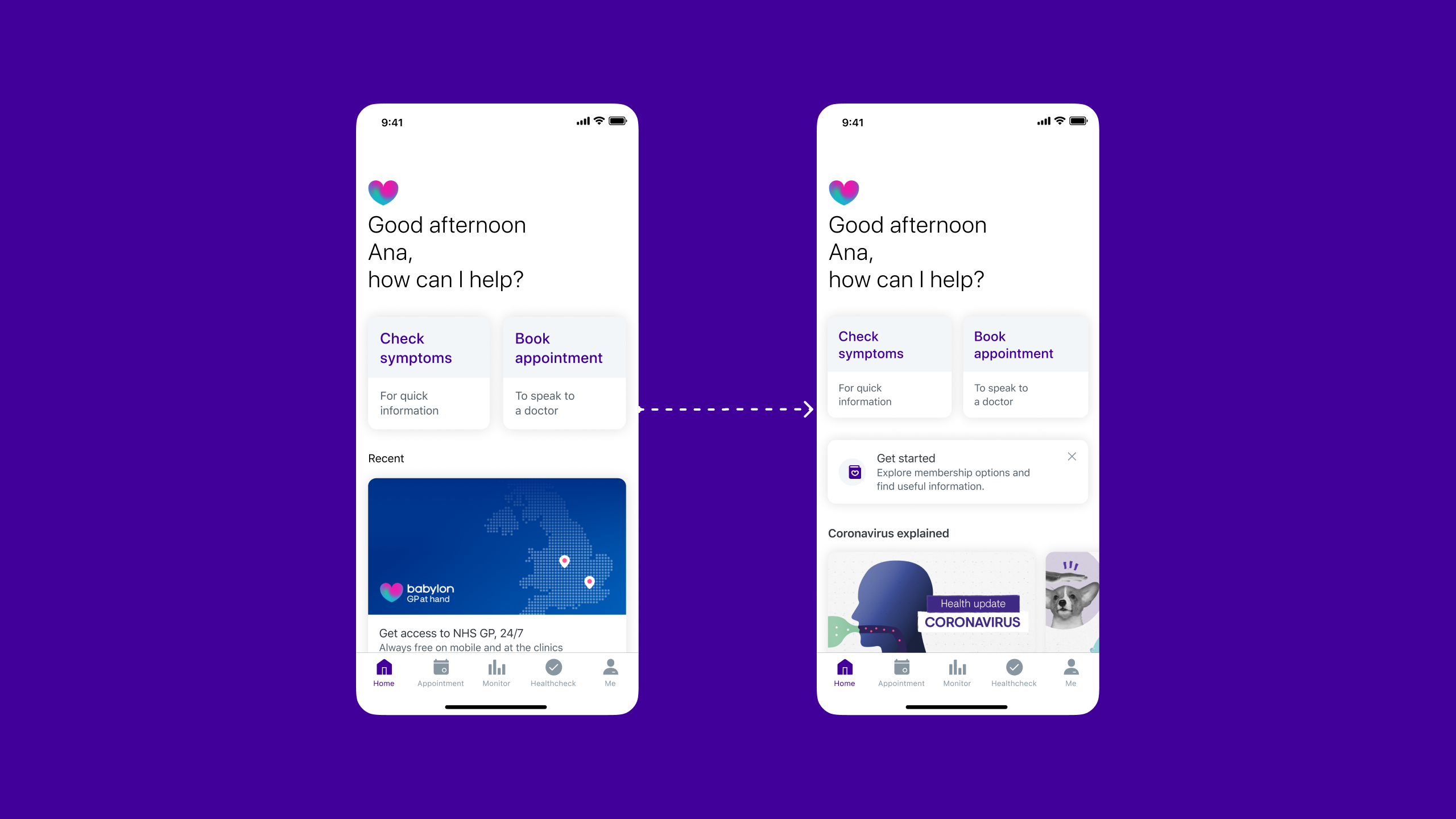
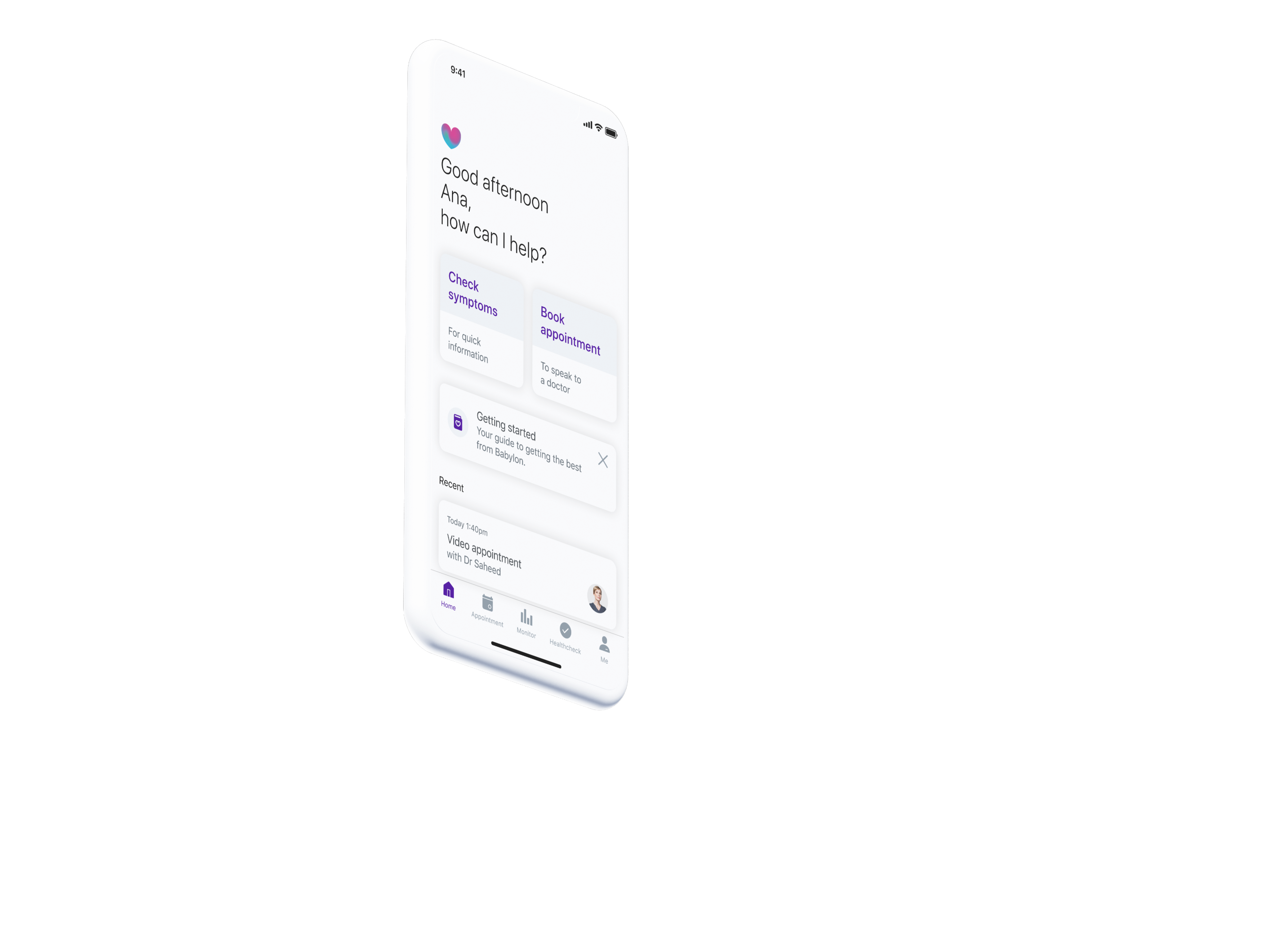
The home screen transformation: the redesigned home screen introduced a dismissible "Get started" card that invited new users to explore membership options and learn about Babylon's services without blocking access to core functionality.
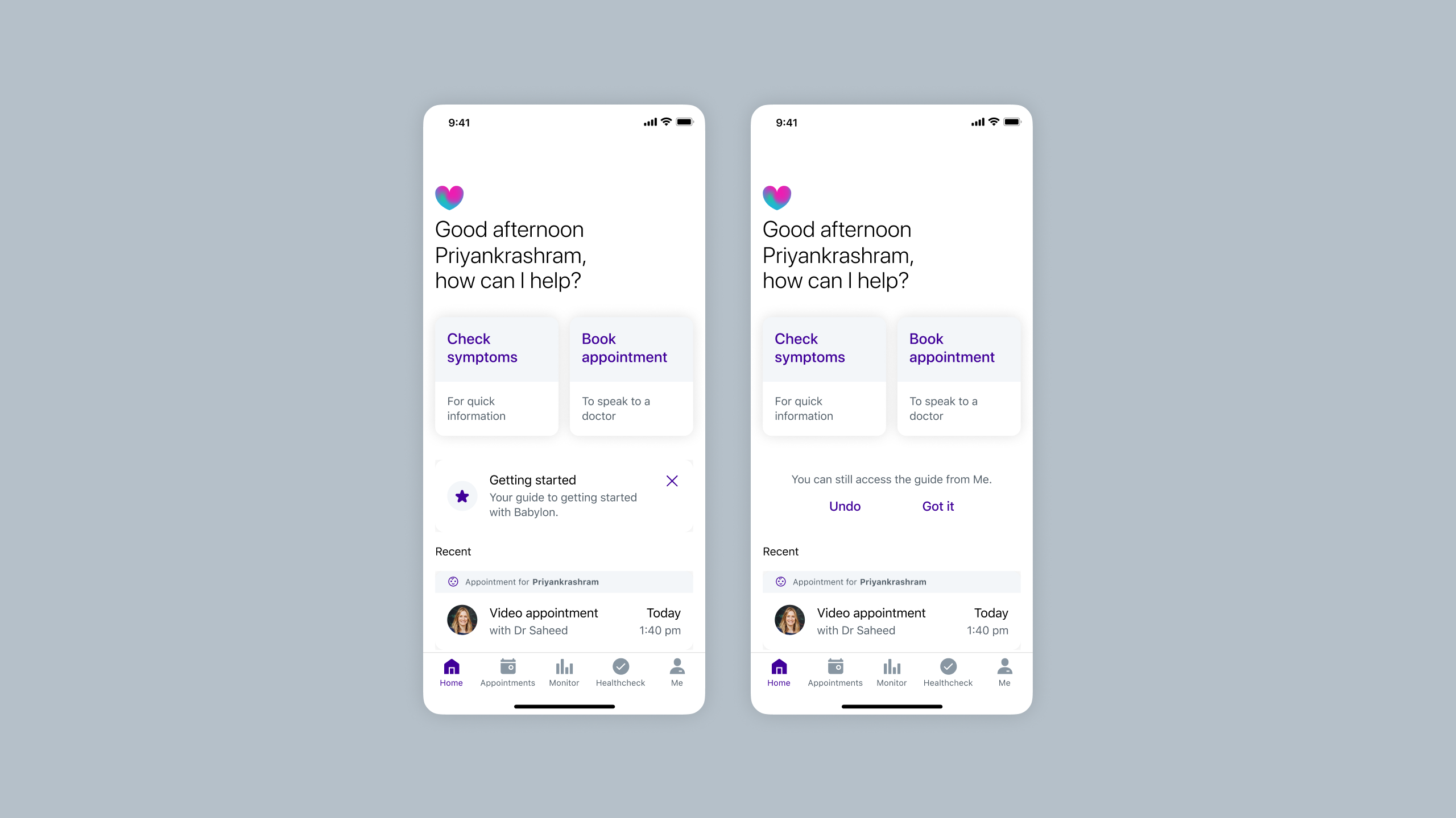
Dismissible card exploration: Rather than using a system popup, I explored custom dismissal patterns to maintain brand and experience alignment. Options ranged from prominent dismiss buttons to undo actions and two-step confirmations, balancing clear action with accidental removal prevention.
Comparing dismissal approaches: custom card design (top) vs native system alert (bottom). I tested both to understand which felt more appropriate for the home screen. The native alert felt more invasive and dramatic than needed. We wanted to inform users, not alarm them. Testing would reveal which approach users found clearer.
Note: Slideshow not visible on mobile. View on tablet or desktop to see testing results.
Choosing a plan felt like gambling
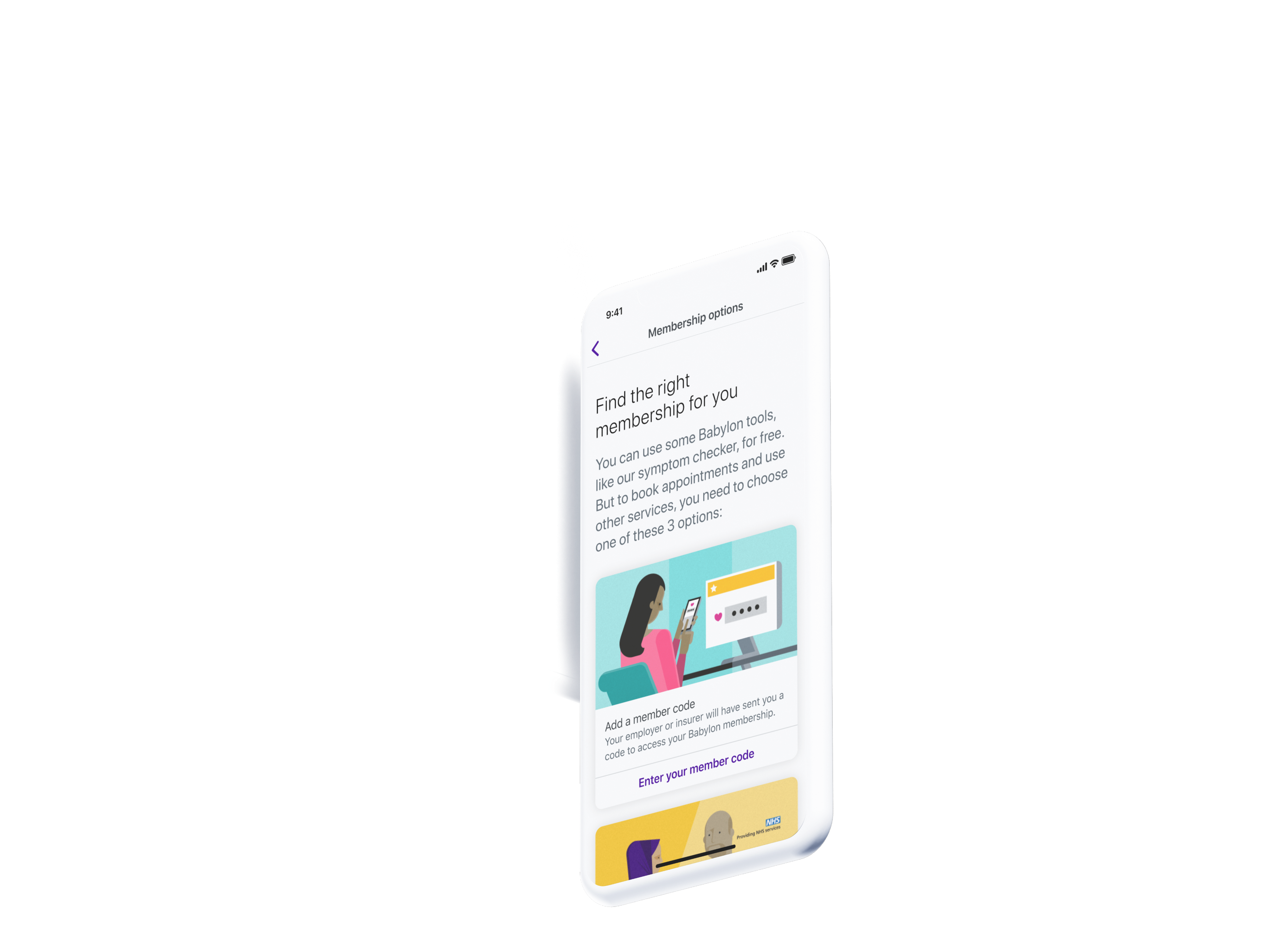
Users couldn't differentiate between membership types (GP at Hand, Private, Pay as you go). The onboarding flow presented these options without context, leading users to gravitate towards "free" options without understanding what that actually meant.
"I don't understand the differences between these plans. What if I pick the wrong one?"
Prospective user, usability testing
I explored multiple approaches through wireframes testing different information hierarchies, progressive disclosure techniques that revealed complexity gradually, and type scales, spacing, and iconography to find the right balance.
This exploration led to several key changes:
- Redesigned plan comparison with clear side-by-side layouts showing what's included, what costs extra, and the core differences
- Worked with our in-house illustrator to create distinctive illustrations for each membership type, helping users quickly distinguish between options whilst elevating the visual quality of the layout
- Made membership implications explicit: GP at Hand required leaving your current GP and a 2-week transfer period
- Collaborated closely with content design to ensure information was delivered clearly and at the right moment, using consistent, human language like "Replace your current NHS provider" instead of technical jargon
- Separated free health tools (symptom checker, health monitor) from clinical services to reduce confusion
- Introduced a comparison table that became the clarity breakthrough
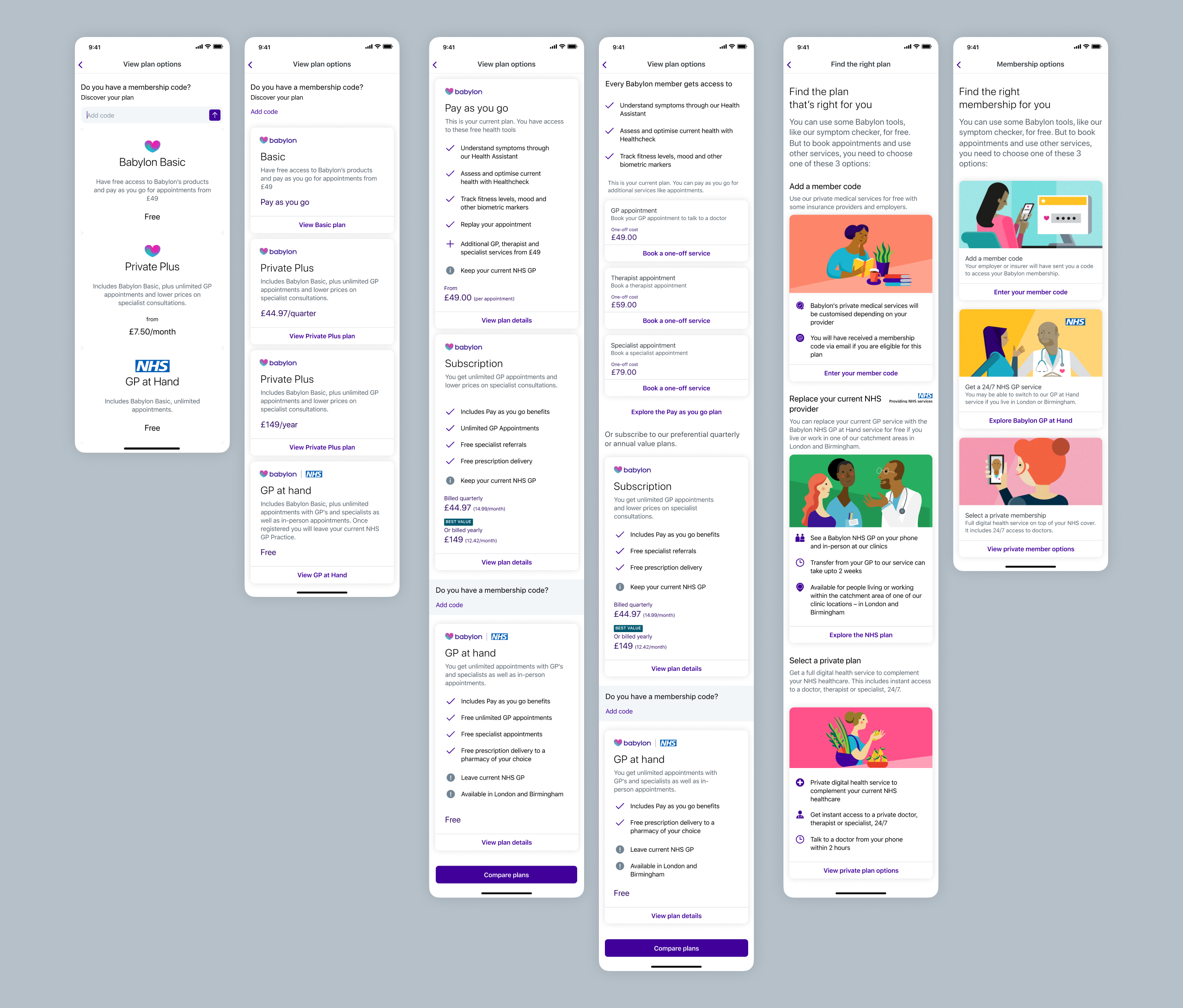
Design evolution of the membership options screen: From initial state (left) to RITE testing (centre) to final iteration (right). Our focus was creating balanced layouts that revealed information at the right moment: essential details upfront, implications when needed.
Note: Slideshow not visible on mobile. View on tablet or desktop to see membership flow evolution.
Answers scattered across the app
Critical information about how appointments worked, what to expect, and eligibility requirements was either missing or spread across disconnected parts of the app. Users couldn't find answers to basic questions needed to make informed decisions.
"How do digital GP appointments actually work? Do I keep my regular doctor?"
Prospective user, usability testing
We addressed this by:
- Created a dedicated "How appointments work" section explaining the end-to-end experience
- Made eligibility and catchment area information discoverable at the right moment
- Clarified the relationship between Babylon, the NHS, and other private healthcare
- Showed what services were included at no extra cost versus paid add-ons
- Used progressive disclosure: essential information first, deeper detail available on demand
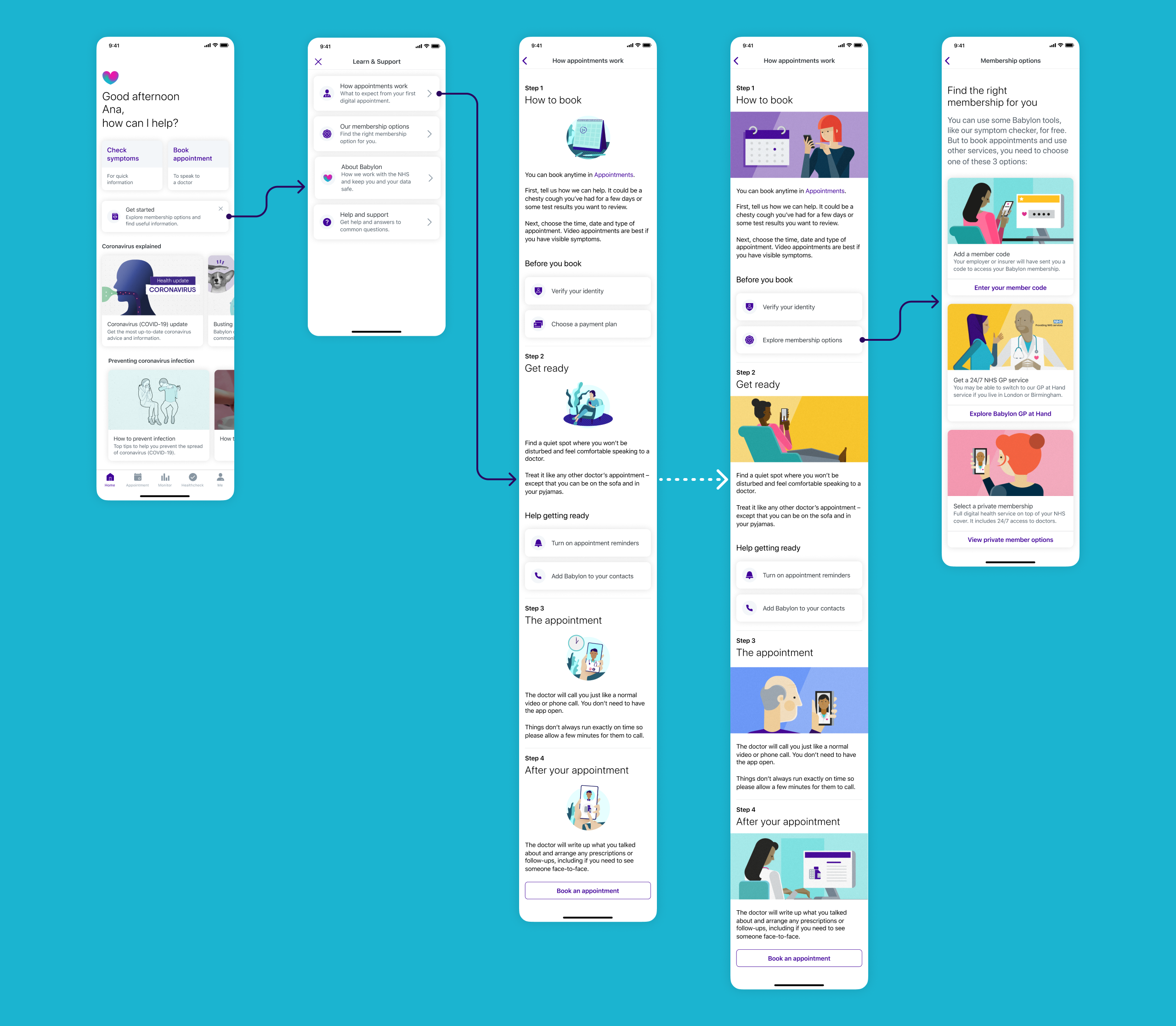
"How appointments work" page flow evolution: From home screen dismissible card through to appointment guidance. We refined wording for clarity and consistency (e.g. "Choose a payment plan" became "Explore membership options") and added custom illustrations to improve content comprehension and create visual consistency across the journey.
What users told us when we tested
Rapid Iterative Testing & Evaluation
Used RITE methodology over 2 days with 6 participants (3 female, 3 male, ages 24-50), testing clickable prototypes and implementing changes between sessions.
Collaborative analysis sessions
After every testing round, the team reviewed notes and patterns from user observations, quickly spotting improvements: clearer button labels, better step order in plan comparison, simplified copy, visual refinements to reduce perceived complexity. Implementing these quick wins between sessions let us validate updates within days.
Key validation moments:
- Plan comparison clarity: Users moved from "I don't understand the differences" to confidently selecting a plan in under 2 minutes
- Information structure: "Very clear, I understood what all the options are" and "brief description about each one and then you can go into it to find out more"
- Comparison table discovery: When users reached the comparison table, multiple participants said "this is the point where I properly understood the plans"
- Timing preference: Majority wanted to see this information during sign-up rather than discovering it later in-app
Critical iterations on RITE Day 1 → Day 2 changes:
- Reduced initial screen from 5 cards to 3 cards for better scannability
- Clarified "GP appointments" as "digital GP appointments" throughout
- Moved confusing "member code" question lower in hierarchy
- Tightened copy to remove jargon and improve readability
Note: Slideshow not visible on mobile. View on tablet or desktop to see testing results.
What we learned to improve:
- Some users missed that GP at Hand included unlimited in-person appointments (this needed stronger visual emphasis)
- The blend of free tools and paid services still created momentary confusion for some users
- Users wanted even more specific information about what conditions could be treated
Remote testing validation post-RITE:
8 additional participants confirmed improvements. Variant B (with clearer visual hierarchy and concise descriptions) outperformed Variant A. Users particularly valued the swipe interaction between plans and found pricing transparency helpful.
Note: Slideshow not visible on mobile. View on tablet or desktop to see testing results.
What changed
For users
- First-time experience transformed from confusing to guided and confident
- Plan selection moved from guesswork to informed decision-making within 2 minutes
- Clear understanding of what Babylon offered before committing to any membership
- Dismissible design respected user autonomy: engage now or later, never blocking
For Babylon
- Reduced confusion-driven customer service enquiries about membership options
- Positioned to improve the 62% non-activation rate by addressing core comprehension barriers
- Scalable guide structure that could accommodate future services and plan updates
For the broader product
- Components and patterns created for this guide were adopted into Babylon's wider design system
- Established a template for explaining complex healthcare concepts to new users
What came after launch
The guide launched as MVP with plans to iterate based on real usage data. V2 roadmap included:
- Introducing the guide earlier into the sign-up flow
- Enhanced plan switching functionality for existing members wanting to upgrade or downgrade
- More granular service detail (specific treatments, conditions, specialist availability)
- A/B testing guide placement and timing to validate impact on activation rates.
If I could revisit this project
- I'd have validated placement earlierWhilst we tested content and structure thoroughly, we could have validated home screen placement versus in-flow placement with higher-fidelity prototypes earlier.
- I'd have pushed for post-launch measurementWe defined activation as our success metric but didn't establish baseline A/B testing infrastructure before launch, making it harder to prove quantitative impact, even though qualitative signals were strong.
- I'd have made the dismissible card more prominentThe card could have been visually more impactful on the home screen for new users, making it feel more welcoming and desirable to explore.
What I learned
Healthcare design requires a different kind of trust
This wasn't e-commerce or entertainment, these were medical decisions affecting people's access to healthcare. Users dealing with questions like "should I leave my GP?" or "can I afford this?" needed absolute clarity. In healthcare design, every ambiguous word erodes trust. The bar for clarity isn't "good enough", it's "could someone's health decision depend on this?"
Respecting autonomy increases engagement
We created something users could dismiss, revisit, or ignore entirely. Testing proved that respecting autonomy increased engagement. Giving users control, not forcing choices, builds more trust than hand-holding.
Comparison is king for high-stakes decisions
The comparison table was our breakthrough. Users needed to see options simultaneously, not sequentially, because healthcare decisions involve weighing multiple factors at once. This pattern became something I'd apply to every future project involving meaningful user decisions.
Research velocity matters as much as research quality
RITE methodology taught me that speed and rigour aren't opposing forces. By Day 2 of testing, we'd validated three rounds of improvements. I learnt that in fast-moving product environments, research that arrives too late has zero impact, no matter how thorough.
Accessibility makes design better for everyone
When we designed for screen readers, we improved information hierarchy. When we increased contrast, visual design got clearer for everyone. Accessibility constraints didn't limit our design, they made it better.
Knowing what not to build
We cut personalised plan recommendations, in-app plan switching, and granular service breakdowns from V1. Not because they weren't valuable, but because solving the core problem ("I don't understand my options") had to come first.
Every healthcare app promises to make healthcare simpler. But simplicity without clarity is just reduction. Making complex things feel simple means making them genuinely understandable, turning guesswork into informed choice, confusion into confidence, abandonment into activation.
Babylon Health
Guiding new members from sign-up to their first appointment


Industry
Health tech
Services
UX/UI Design, User Research & Testing
Year
2020
Platform
iOS/Android App
Role
Product Designer
Team
Cross-functional squad including PM, Analysts, Researcher, 2 Product Designers, Content Designer, Illustration Artist, iOS & Android Engineers
Sign-ups surged.Activation didn't.
Babylon Health was a digital healthcare platform offering AI-powered health tools, virtual GP appointments, and wellness tracking across the UK, US, and Rwanda. When COVID-19 hit, sign-ups surged. But 62% of new users never activated their accounts within 30 days.
The app dropped users onto a home screen that offered little value after sign-up. Generic content cards and quick actions provided no guidance about what Babylon offered, how appointments worked, or which membership plan suited their needs. Users were left to figure it out alone, and most simply didn't.
Babylon was spending more to acquire users, but most were leaving before ever experiencing the value of the service. We needed to turn those first confusing moments into confident ones.

Before redesign: Users landed on a home screen with no clear guidance, then had to navigate "Me" > "Help" to find plan information. Inconsistent labelling ("Get started" vs "Help"), unclear distinctions between membership types and payment options, and information revealed at the wrong moments created confusion throughout the journey.
Impact after redesign
Under 2 minutes
previously confused users made confident decisions, unlocking activation for 62% of drop-offs.
Outcomes
What I work on
Translating research into design decisions
Collaborated with researchers through multiple testing rounds, converting insights into specific design interventions.
Designing the onboarding flow
Designed the UI for a "Getting Started" guide, shaping how new users would discover services, compare membership options, and take their first action.
Working within design system constraints
Applied Babylon's design system consistently whilst proposing targeted updates to support new onboarding patterns across iOS and Android.
Rapid iteration through testing
Used RITE methodology implementing changes between sessions to validate improvements quickly.
What was broken and how we fixed it
Through analytics, customer service data, and usability testing, we uncovered three critical problems blocking activation:
New users had nowhere to go
Drop-off rates within the first 30 days were significantly high. Users landed on a home screen with no clear path forward, no sense of what Babylon offered, or how anything worked.
"I don't know where to go from here. What am I supposed to do?"
Prospective user, usability testing
What we did:
- Introduced a dismissible "Getting Started" guide visible on the home screen, inviting exploration without blocking core functionality
- Created an always-accessible entry point in the user's profile
- Organised information into clear, interactive steps: compare membership options, understand what's included, activate a plan or explore the app, book appointments or try health tools
- Made each section progressively informative, starting with high-level overviews, then revealing detail on demand
Working closely with content design throughout, we ensured every headline, sentence, and piece of information supported understanding and trust whilst being delivered at exactly the right moment in the user's journey.

The home screen transformation: the redesigned home screen introduced a dismissible "Get started" card that invited new users to explore membership options and learn about Babylon's services without blocking access to core functionality.

Dismissible card exploration: Rather than using a system popup, I explored custom dismissal patterns to maintain brand and experience alignment. Options ranged from prominent dismiss buttons to undo actions and two-step confirmations, balancing clear action with accidental removal prevention.
Comparing dismissal approaches: custom card design (left) vs native system alert (right). I tested both to understand which felt more appropriate for the home screen. The native alert felt more invasive and dramatic than needed. We wanted to inform users, not alarm them. Testing would reveal which approach users found clearer.
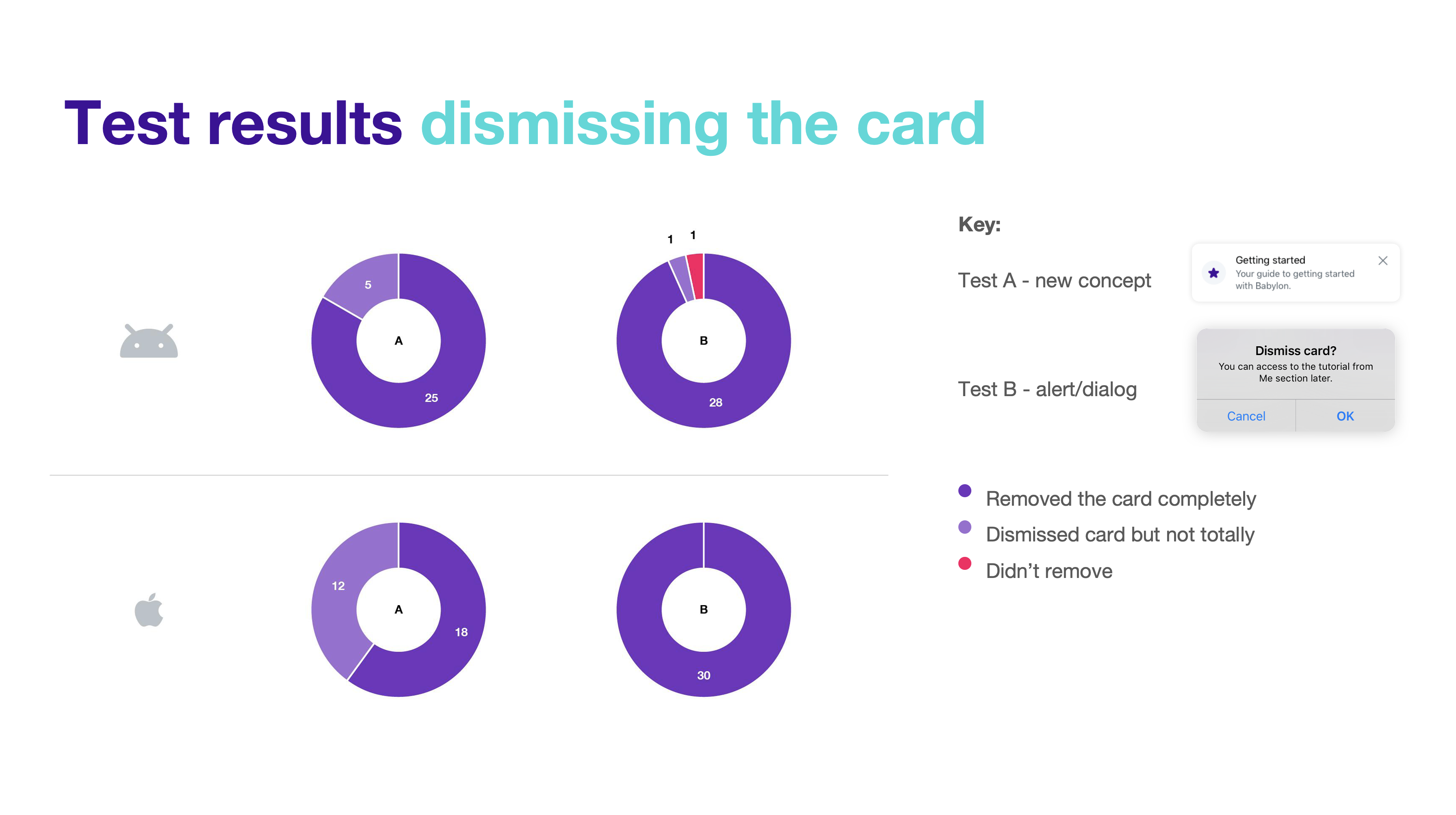
Testing results: Comparing dismissal success and message comprehension. Whilst the native alert achieved higher complete removal rates, the custom card performed better for message retention and felt more appropriate to users. A simple copy change (from "Got it" to "Remove" or "Close") would likely improve the custom card's removal success rate whilst maintaining its strengths in brand alignment and user experience.
Choosing a plan felt like gambling
Users couldn't differentiate between membership types (GP at Hand, Private, Pay as you go). The onboarding flow presented these options without context, leading users to gravitate towards "free" options without understanding what that actually meant.
"I don't understand the differences between these plans. What if I pick the wrong one?"
Prospective user, usability testing
I explored multiple approaches through wireframes testing different information hierarchies, progressive disclosure techniques that revealed complexity gradually, and type scales, spacing, and iconography to find the right balance.
This exploration led to several key changes:
- Redesigned plan comparison with clear side-by-side layouts showing what's included, what costs extra, and the core differences
- Worked with our in-house illustrator to create distinctive illustrations for each membership type, helping users quickly distinguish between options whilst elevating the visual quality of the layout
- Made membership implications explicit: GP at Hand required leaving your current GP and a 2-week transfer period
- Collaborated closely with content design to ensure information was delivered clearly and at the right moment, using consistent, human language like "Replace your current NHS provider" instead of technical jargon
- Separated free health tools (symptom checker, health monitor) from clinical services to reduce confusion
- Introduced a comparison table that became the clarity breakthrough

Design evolution of the membership options screen: From initial state (left) to RITE testing (centre) to final iteration (right). Our focus was creating balanced layouts that revealed information at the right moment: essential details upfront, implications when needed.
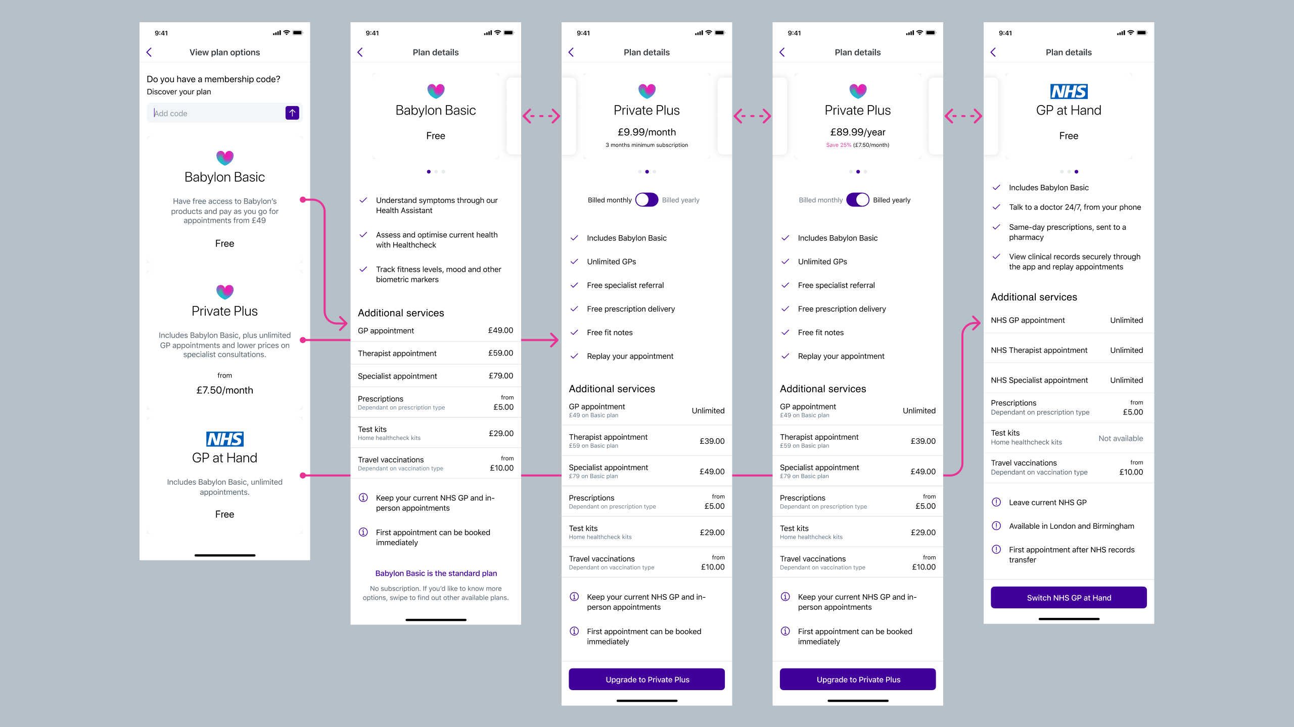
Membership flow evolution: Testing revealed the comparison table worked best for comparable options only. We used progressive disclosure: first helping users understand membership types, then comparing Babylon Private payment options after they'd selected private service. This prevented users from defaulting to "free" without understanding the implications.
Answers scattered across the app
Critical information about how appointments worked, what to expect, and eligibility requirements was either missing or spread across disconnected parts of the app. Users couldn't find answers to basic questions needed to make informed decisions.
"How do digital GP appointments actually work? Do I keep my regular doctor?"
Prospective user, usability testing
We addressed this by:
- Created a dedicated "How appointments work" section explaining the end-to-end experience
- Made eligibility and catchment area information discoverable at the right moment
- Clarified the relationship between Babylon, the NHS, and other private healthcare
- Showed what services were included at no extra cost versus paid add-ons
- Used progressive disclosure: essential information first, deeper detail available on demand

"How appointments work" page flow evolution: From home screen dismissible card through to appointment guidance. We refined wording for clarity and consistency (e.g. "Choose a payment plan" became "Explore membership options") and added custom illustrations to improve content comprehension and create visual consistency across the journey.
What users told us when we tested
Rapid Iterative Testing & Evaluation
Used RITE methodology over 2 days with 6 participants (3 female, 3 male, ages 24-50), testing clickable prototypes and implementing changes between sessions.
Collaborative analysis sessions
After every testing round, the team reviewed notes and patterns from user observations, quickly spotting improvements: clearer button labels, better step order in plan comparison, simplified copy, visual refinements to reduce perceived complexity. Implementing these quick wins between sessions let us validate updates within days.
Key validation moments:
- Plan comparison clarity: Users moved from "I don't understand the differences" to confidently selecting a plan in under 2 minutes
- Information structure: "Very clear, I understood what all the options are" and "brief description about each one and then you can go into it to find out more"
- Comparison table discovery: When users reached the comparison table, multiple participants said "this is the point where I properly understood the plans"
- Timing preference: Majority wanted to see this information during sign-up rather than discovering it later in-app
Critical iterations on RITE Day 1 → Day 2 changes:
- Reduced initial screen from 5 cards to 3 cards for better scannability
- Clarified "GP appointments" as "digital GP appointments" throughout
- Moved confusing "member code" question lower in hierarchy
- Tightened copy to remove jargon and improve readability
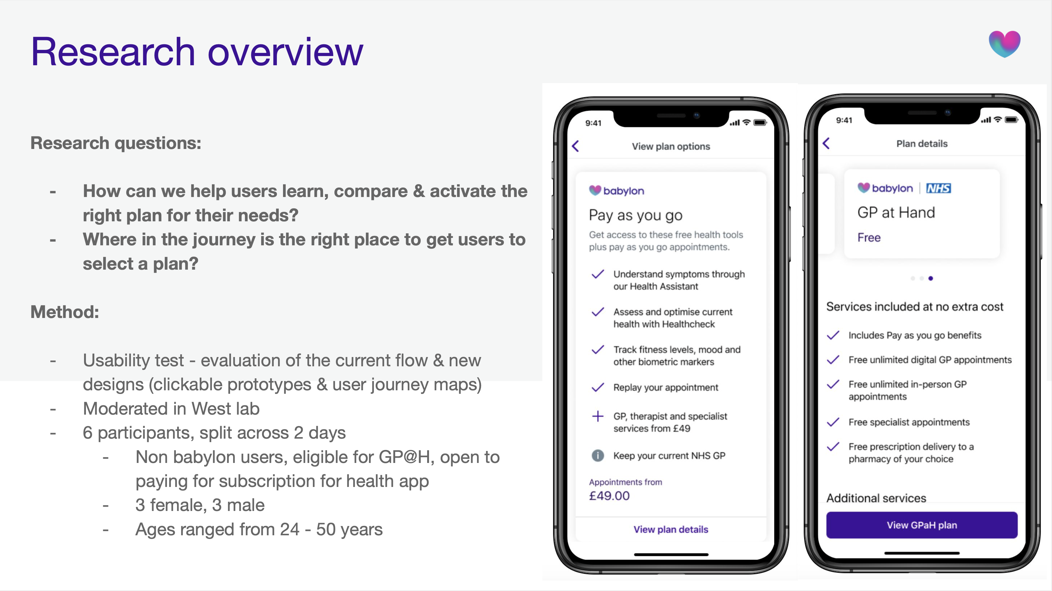
RITE Day 1 to Day 2 refinements: Based on collaborative analysis sessions, we reduced card count from 5 to 3 for better scannability, refined copy to remove jargon, and adjusted visual hierarchy. Annotated screens show specific changes informed by user testing.
What we learned to improve:
- Some users missed that GP at Hand included unlimited in-person appointments (this needed stronger visual emphasis)
- The blend of free tools and paid services still created momentary confusion for some users
- Users wanted even more specific information about what conditions could be treated
Remote testing validation post-RITE:
8 additional participants confirmed improvements. Variant B (with clearer visual hierarchy and concise descriptions) outperformed Variant A. Users particularly valued the swipe interaction between plans and found pricing transparency helpful.
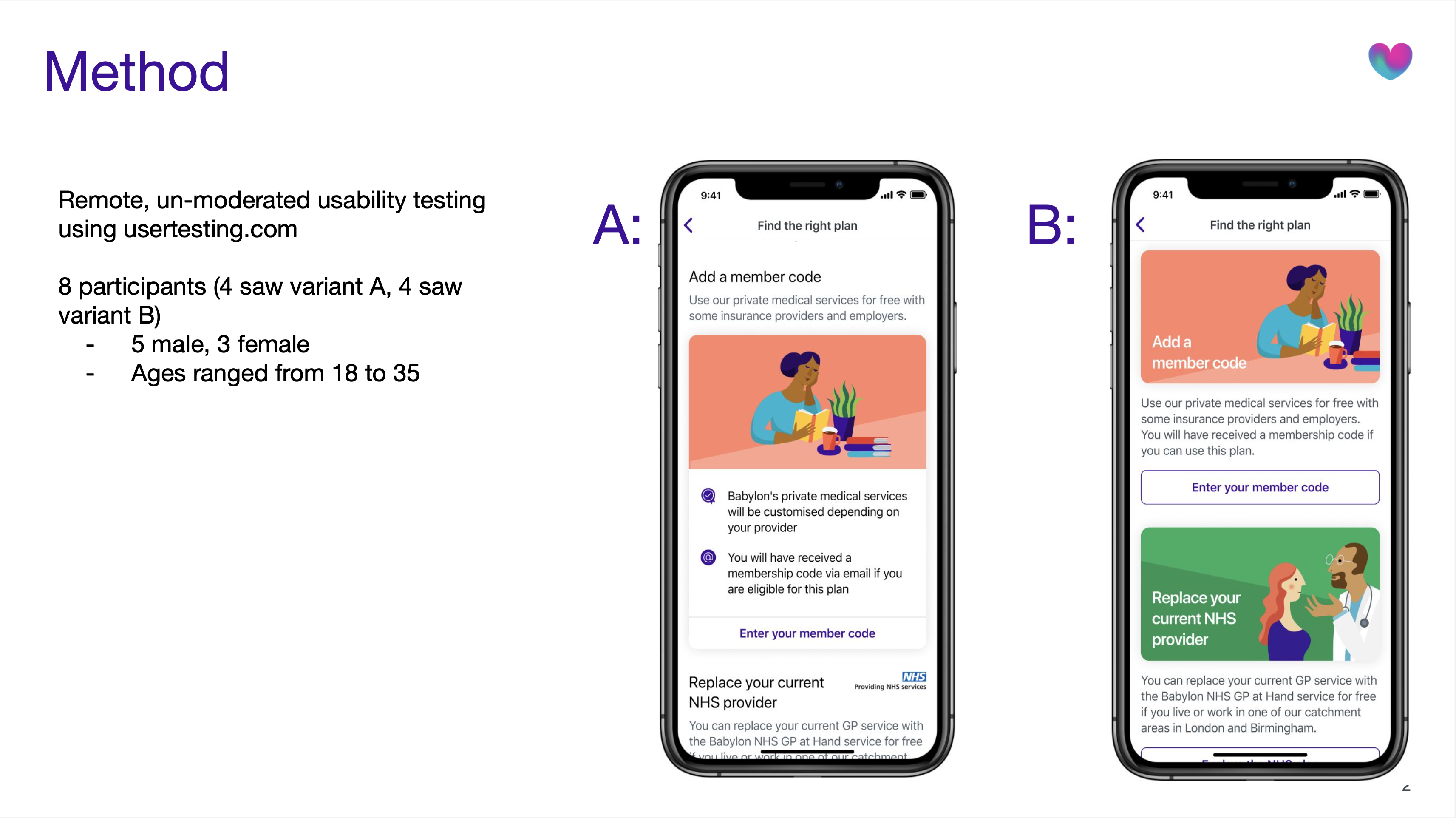
Remote testing validation: Annotated screens showing key findings from 8 UserTesting.com participants. Users valued the ability to quickly scan three membership types, appreciated progressive disclosure revealing detail on demand, and found pricing transparency helpful for decision-making.
What changed
For users
- First-time experience transformed from confusing to guided and confident
- Plan selection moved from guesswork to informed decision-making within 2 minutes
- Clear understanding of what Babylon offered before committing to any membership
- Dismissible design respected user autonomy: engage now or later, never blocking
For Babylon
- Reduced confusion-driven customer service enquiries about membership options
- Positioned to improve the 62% non-activation rate by addressing core comprehension barriers
- Scalable guide structure that could accommodate future services and plan updates
For the broader product
- Components and patterns created for this guide were adopted into Babylon's wider design system
- Established a template for explaining complex healthcare concepts to new users
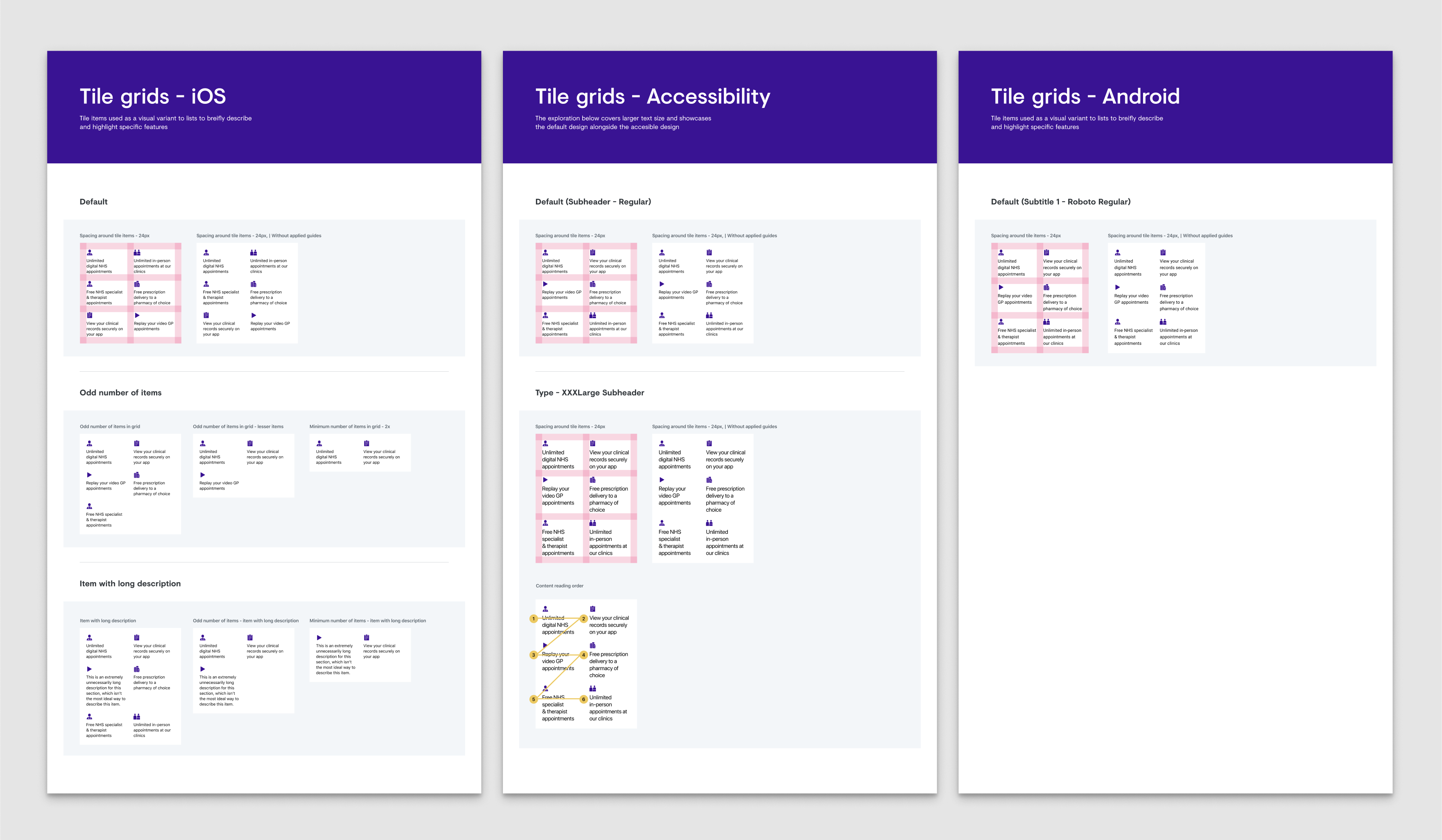
New components integrated into the design system: Service rows displaying services and pricing, implication cards highlighting critical information (like NHS GP at Hand requirements), and service grid components listing features across membership options. All components were designed with accessibility embedded, including proper reading order, contrast ratios, and screen reader compatibility.
What came after launch
The guide launched as MVP with plans to iterate based on real usage data. V2 roadmap included:
- Introducing the guide earlier into the sign-up flow
- Enhanced plan switching functionality for existing members wanting to upgrade or downgrade
- More granular service detail (specific treatments, conditions, specialist availability)
- A/B testing guide placement and timing to validate impact on activation rates.
If I could revisit this project
- I'd have validated placement earlierWhilst we tested content and structure thoroughly, we could have validated home screen placement versus in-flow placement with higher-fidelity prototypes earlier.
- I'd have pushed for post-launch measurementWe defined activation as our success metric but didn't establish baseline A/B testing infrastructure before launch, making it harder to prove quantitative impact, even though qualitative signals were strong.
- I'd have made the dismissible card more prominentThe card could have been visually more impactful on the home screen for new users, making it feel more welcoming and desirable to explore.
What I learned
Healthcare design requires a different kind of trust
This wasn't e-commerce or entertainment, these were medical decisions affecting people's access to healthcare. Users dealing with questions like "should I leave my GP?" or "can I afford this?" needed absolute clarity. In healthcare design, every ambiguous word erodes trust. The bar for clarity isn't "good enough", it's "could someone's health decision depend on this?"
Respecting autonomy increases engagement
We created something users could dismiss, revisit, or ignore entirely. Testing proved that respecting autonomy increased engagement. Giving users control, not forcing choices, builds more trust than hand-holding.
Comparison is king for high-stakes decisions
The comparison table was our breakthrough. Users needed to see options simultaneously, not sequentially, because healthcare decisions involve weighing multiple factors at once. This pattern became something I'd apply to every future project involving meaningful user decisions.
Research velocity matters as much as research quality
RITE methodology taught me that speed and rigour aren't opposing forces. By Day 2 of testing, we'd validated three rounds of improvements. I learnt that in fast-moving product environments, research that arrives too late has zero impact, no matter how thorough.
Accessibility makes design better for everyone
When we designed for screen readers, we improved information hierarchy. When we increased contrast, visual design got clearer for everyone. Accessibility constraints didn't limit our design, they made it better.
Knowing what not to build
We cut personalised plan recommendations, in-app plan switching, and granular service breakdowns from V1. Not because they weren't valuable, but because solving the core problem ("I don't understand my options") had to come first.
Every healthcare app promises to make healthcare simpler. But simplicity without clarity is just reduction. Making complex things feel simple means making them genuinely understandable, turning guesswork into informed choice, confusion into confidence, abandonment into activation.
Babylon Health
Guiding new members from sign-up to their first appointment


Industry
Health tech
Services
UX/UI Design, User Research & Testing
Year
2020
Platform
iOS/Android App
Role
Product Designer
Team
Cross-functional squad including PM, Analysts, Researcher, 2 Product Designers, Content Designer, Illustration Artist, iOS & Android Engineers
Sign-ups surged.Activation didn't.
Babylon Health was a digital healthcare platform offering AI-powered health tools, virtual GP appointments, and wellness tracking across the UK, US, and Rwanda. When COVID-19 hit, sign-ups surged. But 62% of new users never activated their accounts within 30 days.
The app dropped users onto a home screen that offered little value after sign-up. Generic content cards and quick actions provided no guidance about what Babylon offered, how appointments worked, or which membership plan suited their needs. Users were left to figure it out alone, and most simply didn't.
Babylon was spending more to acquire users, but most were leaving before ever experiencing the value of the service. We needed to turn those first confusing moments into confident ones.

Before redesign: Users landed on a home screen with no clear guidance, then had to navigate "Me" > "Help" to find plan information. Inconsistent labelling ("Get started" vs "Help"), unclear distinctions between membership types and payment options, and information revealed at the wrong moments created confusion throughout the journey.
Impact after redesign
Under 2 minutes
previously confused users made confident decisions, unlocking activation for 62% of drop-offs.
Outcomes
What I work on
Translating research into design decisions
Collaborated with researchers through multiple testing rounds, converting insights into specific design interventions.
Designing the onboarding flow
Designed the UI for a "Getting Started" guide, shaping how new users would discover services, compare membership options, and take their first action.
Working within design system constraints
Applied Babylon's design system consistently whilst proposing targeted updates to support new onboarding patterns across iOS and Android.
Rapid iteration through testing
Used RITE methodology implementing changes between sessions to validate improvements quickly.
What was broken and
how we fixed it
Through analytics, customer service data, and usability testing, we uncovered three critical problems blocking activation:
New users had nowhere to go
Drop-off rates within the first 30 days were significantly high. Users landed on a home screen with no clear path forward, no sense of what Babylon offered, or how anything worked.
"I don't know where to go from here. What am I supposed to do?"
Prospective user, usability testing
What we did:
- Introduced a dismissible "Getting Started" guide visible on the home screen, inviting exploration without blocking core functionality
- Created an always-accessible entry point in the user's profile
- Organised information into clear, interactive steps: compare membership options, understand what's included, activate a plan or explore the app, book appointments or try health tools
- Made each section progressively informative, starting with high-level overviews, then revealing detail on demand
Working closely with content design throughout, we ensured every headline, sentence, and piece of information supported understanding and trust whilst being delivered at exactly the right moment in the user's journey.

The home screen transformation: the redesigned home screen introduced a dismissible "Get started" card that invited new users to explore membership options and learn about Babylon's services without blocking access to core functionality.

Dismissible card exploration: Rather than using a system popup, I explored custom dismissal patterns to maintain brand and experience alignment. Options ranged from prominent dismiss buttons to undo actions and two-step confirmations, balancing clear action with accidental removal prevention.
Comparing dismissal approaches: custom card design (left) vs native system alert (right). I tested both to understand which felt more appropriate for the home screen. The native alert felt more invasive and dramatic than needed. We wanted to inform users, not alarm them. Testing would reveal which approach users found clearer.

Testing results: Comparing dismissal success and message comprehension. Whilst the native alert achieved higher complete removal rates, the custom card performed better for message retention and felt more appropriate to users. A simple copy change (from "Got it" to "Remove" or "Close") would likely improve the custom card's removal success rate whilst maintaining its strengths in brand alignment and user experience.
Choosing a plan felt like gambling
Users couldn't differentiate between membership types (GP at Hand, Private, Pay as you go). The onboarding flow presented these options without context, leading users to gravitate towards "free" options without understanding what that actually meant.
"I don't understand the differences between these plans. What if I pick the wrong one?"
Prospective user, usability testing
I explored multiple approaches through wireframes testing different information hierarchies, progressive disclosure techniques that revealed complexity gradually, and type scales, spacing, and iconography to find the right balance.
This exploration led to several key changes:
- Redesigned plan comparison with clear side-by-side layouts showing what's included, what costs extra, and the core differences
- Worked with our in-house illustrator to create distinctive illustrations for each membership type, helping users quickly distinguish between options whilst elevating the visual quality of the layout
- Made membership implications explicit: GP at Hand required leaving your current GP and a 2-week transfer period
- Collaborated closely with content design to ensure information was delivered clearly and at the right moment, using consistent, human language like "Replace your current NHS provider" instead of technical jargon
- Separated free health tools (symptom checker, health monitor) from clinical services to reduce confusion
- Introduced a comparison table that became the clarity breakthrough

Design evolution of the membership options screen: From initial state (left) to RITE testing (centre) to final iteration (right). Our focus was creating balanced layouts that revealed information at the right moment: essential details upfront, implications when needed.

Membership flow evolution: Testing revealed the comparison table worked best for comparable options only. We used progressive disclosure: first helping users understand membership types, then comparing Babylon Private payment options after they'd selected private service. This prevented users from defaulting to "free" without understanding the implications.
Answers scattered across the app
Critical information about how appointments worked, what to expect, and eligibility requirements was either missing or spread across disconnected parts of the app. Users couldn't find answers to basic questions needed to make informed decisions.
"How do digital GP appointments actually work? Do I keep my regular doctor?"
Prospective user, usability testing
We addressed this by:
- Created a dedicated "How appointments work" section explaining the end-to-end experience
- Made eligibility and catchment area information discoverable at the right moment
- Clarified the relationship between Babylon, the NHS, and other private healthcare
- Showed what services were included at no extra cost versus paid add-ons
- Used progressive disclosure: essential information first, deeper detail available on demand

"How appointments work" page flow evolution: From home screen dismissible card through to appointment guidance. We refined wording for clarity and consistency (e.g. "Choose a payment plan" became "Explore membership options") and added custom illustrations to improve content comprehension and create visual consistency across the journey.
What users told uswhen we tested
Rapid Iterative Testing & Evaluation
Used RITE methodology over 2 days with 6 participants (3 female, 3 male, ages 24-50), testing clickable prototypes and implementing changes between sessions.
Collaborative analysis sessions
After every testing round, the team reviewed notes and patterns from user observations, quickly spotting improvements: clearer button labels, better step order in plan comparison, simplified copy, visual refinements to reduce perceived complexity. Implementing these quick wins between sessions let us validate updates within days.
Key validation moments:
- Plan comparison clarity: Users moved from "I don't understand the differences" to confidently selecting a plan in under 2 minutes
- Information structure: "Very clear, I understood what all the options are" and "brief description about each one and then you can go into it to find out more"
- Comparison table discovery: When users reached the comparison table, multiple participants said "this is the point where I properly understood the plans"
- Timing preference: Majority wanted to see this information during sign-up rather than discovering it later in-app
Critical iterations on RITE Day 1 → Day 2 changes:
- Reduced initial screen from 5 cards to 3 cards for better scannability
- Clarified "GP appointments" as "digital GP appointments" throughout
- Moved confusing "member code" question lower in hierarchy
- Tightened copy to remove jargon and improve readability

RITE Day 1 to Day 2 refinements: Based on collaborative analysis sessions, we reduced card count from 5 to 3 for better scannability, refined copy to remove jargon, and adjusted visual hierarchy. Annotated screens show specific changes informed by user testing.
What we learned to improve:
- Some users missed that GP at Hand included unlimited in-person appointments (this needed stronger visual emphasis)
- The blend of free tools and paid services still created momentary confusion for some users
- Users wanted even more specific information about what conditions could be treated
Remote testing validation post-RITE:
8 additional participants confirmed improvements. Variant B (with clearer visual hierarchy and concise descriptions) outperformed Variant A. Users particularly valued the swipe interaction between plans and found pricing transparency helpful.

Remote testing validation: Annotated screens showing key findings from 8 UserTesting.com participants. Users valued the ability to quickly scan three membership types, appreciated progressive disclosure revealing detail on demand, and found pricing transparency helpful for decision-making.
What changed
For users
- First-time experience transformed from confusing to guided and confident
- Plan selection moved from guesswork to informed decision-making within 2 minutes
- Clear understanding of what Babylon offered before committing to any membership
- Dismissible design respected user autonomy: engage now or later, never blocking
For Babylon
- Reduced confusion-driven customer service enquiries about membership options
- Positioned to improve the 62% non-activation rate by addressing core comprehension barriers
- Scalable guide structure that could accommodate future services and plan updates
For the broader product
- Components and patterns created for this guide were adopted into Babylon's wider design system
- Established a template for explaining complex healthcare concepts to new users

New components integrated into the design system: Service rows displaying services and pricing, implication cards highlighting critical information (like NHS GP at Hand requirements), and service grid components listing features across membership options. All components were designed with accessibility embedded, including proper reading order, contrast ratios, and screen reader compatibility.
What came after launch
The guide launched as MVP with plans to iterate based on real usage data. V2 roadmap included:
- Introducing the guide earlier into the sign-up flow
- Enhanced plan switching functionality for existing members wanting to upgrade or downgrade
- More granular service detail (specific treatments, conditions, specialist availability)
- A/B testing guide placement and timing to validate impact on activation rates.
If I could revisit this project
- I'd have validated placement earlierWhilst we tested content and structure thoroughly, we could have validated home screen placement versus in-flow placement with higher-fidelity prototypes earlier.
- I'd have pushed for post-launch measurementWe defined activation as our success metric but didn't establish baseline A/B testing infrastructure before launch, making it harder to prove quantitative impact, even though qualitative signals were strong.
- I'd have made the dismissible card more prominentThe card could have been visually more impactful on the home screen for new users, making it feel more welcoming and desirable to explore.
What I learned
Healthcare design requires a different kind of trust
This wasn't e-commerce or entertainment, these were medical decisions affecting people's access to healthcare. Users dealing with questions like "should I leave my GP?" or "can I afford this?" needed absolute clarity. In healthcare design, every ambiguous word erodes trust. The bar for clarity isn't "good enough", it's "could someone's health decision depend on this?"
Respecting autonomy increases engagement
We created something users could dismiss, revisit, or ignore entirely. Testing proved that respecting autonomy increased engagement. Giving users control, not forcing choices, builds more trust than hand-holding.
Comparison is king for high-stakes decisions
The comparison table was our breakthrough. Users needed to see options simultaneously, not sequentially, because healthcare decisions involve weighing multiple factors at once. This pattern became something I'd apply to every future project involving meaningful user decisions.
Research velocity matters as much as research quality
RITE methodology taught me that speed and rigour aren't opposing forces. By Day 2 of testing, we'd validated three rounds of improvements. I learnt that in fast-moving product environments, research that arrives too late has zero impact, no matter how thorough.
Accessibility makes design better for everyone
When we designed for screen readers, we improved information hierarchy. When we increased contrast, visual design got clearer for everyone. Accessibility constraints didn't limit our design, they made it better.
Knowing what not to build
We cut personalised plan recommendations, in-app plan switching, and granular service breakdowns from V1. Not because they weren't valuable, but because solving the core problem ("I don't understand my options") had to come first.
Every healthcare app promises to make healthcare simpler. But simplicity without clarity is just reduction. Making complex things feel simple means making them genuinely understandable, turning guesswork into informed choice, confusion into confidence, abandonment into activation.
